UI: Main Menu and HUD
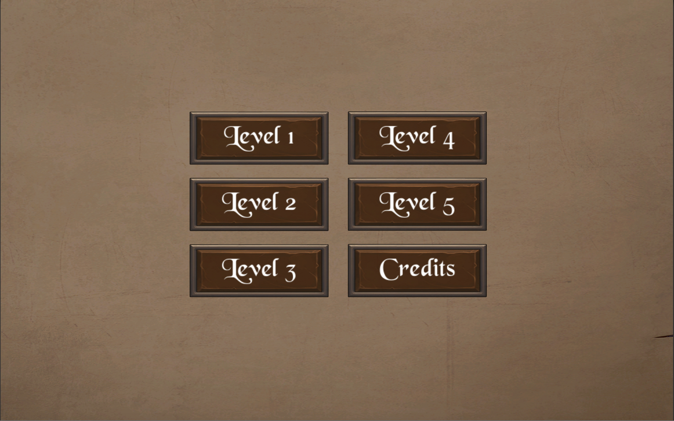
The main menu of the game right now is very simple. I just used some of the medieval assets from other parts of the game to make it match in theming, but it won't stay the way it is for long. I just needed a way to switch between Levels from play-mode without having to exit the game and manually switch scenes from the editor.

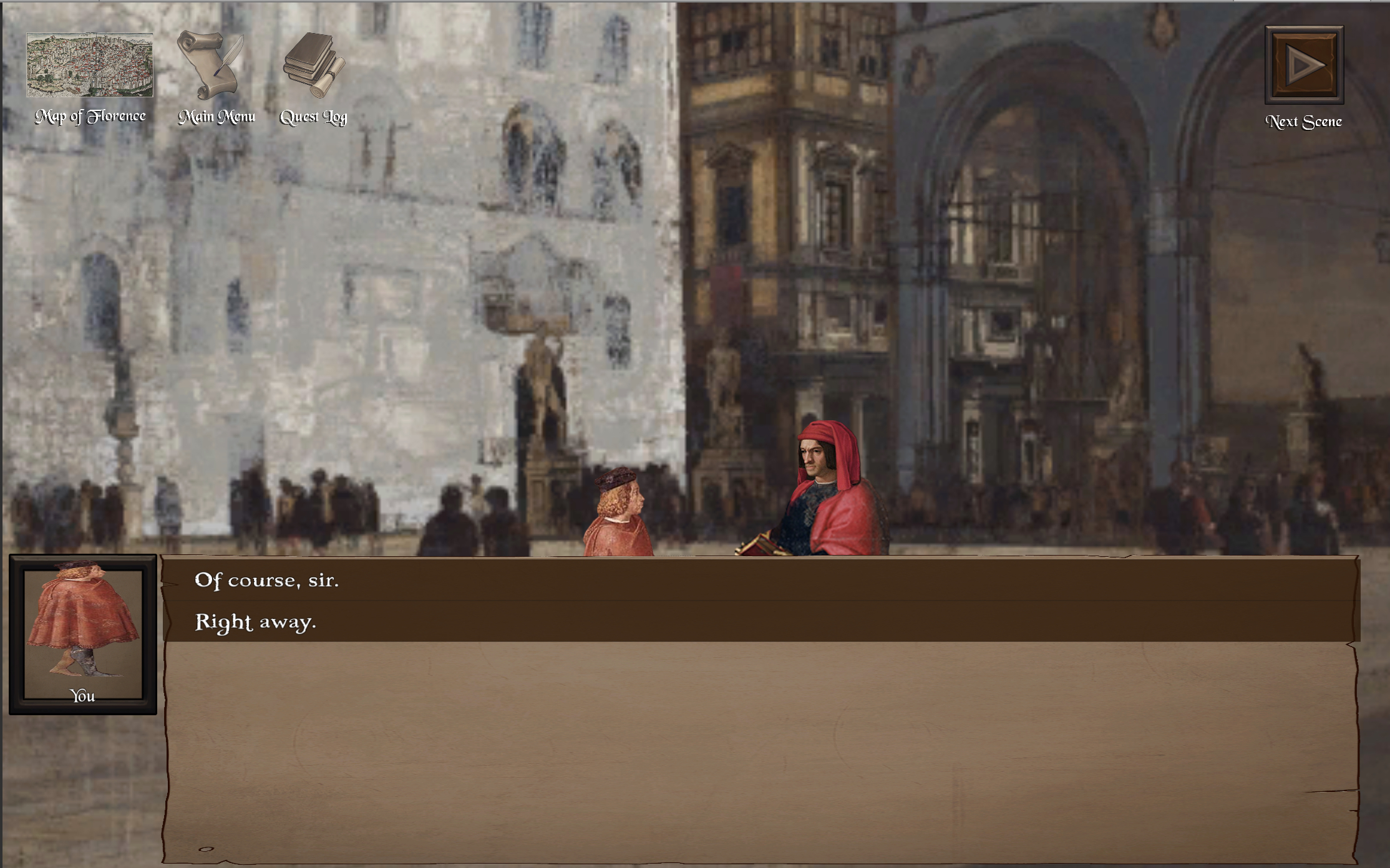
The more interesting part of this discussion post is the HUD (Head's Up Display). At the top of the screen, out of the way of gameplay but never out of sight, the player can find a series of buttons to help them navigate the game. In the top left, there is a Map to help them move around Florence, a button to access the Main Menu where they can easily switch to a different Level, and a button to pull up their Quest Log for keeping track of their objectives.
In the top right corner, there is a temporary button to go to the next scene. This will not be in the final game, but it is very useful for me while I am building and testing the game. Ideally, the player will be lead organically from scene to scene as they complete quests and advance the story. Until that is possible, I have this button. Each conversation is part of a unique scene, but each level could have 5+ conversations, and therefore 5+ scenes. Until the path through the game is clear for players, we can just click this button to keep things moving.
All of the buttons are visible but slightly transparent so they can blur into the player's periphery until they need them. Once they mouse over a button, it lights up to show it is interactable.

Now that I have these buttons, I can easily access every part of the game from within the game itself. It's a big step forward! And I love the way the HUD looks. It's theming works well with the Renaissance art style, and I think the placement is both intuitive and non-distracting. It's very simple, but does a lot of heavy lifting for UX.
Get The Pazzi Conspiracy: An Educational Video Game
The Pazzi Conspiracy: An Educational Video Game
a historical game to teach university students about the Italian Renaissance
| Status | Released |
| Author | Haley Price |
| Genre | Educational |
| Tags | 2D, Historical, Point & Click, Story Rich |
More posts
- Install InstructionsOct 08, 2021
- Video ExegesisMay 13, 2021
- CitationsMay 07, 2021
- Writing a Teaching Guide IIMay 06, 2021
- Writing a Teaching GuideMay 06, 2021
Leave a comment
Log in with itch.io to leave a comment.