UI: Overall Theming
For the UI, I wanted everything to be very simple and feel medieval. The medieval RPG genre of video games is so well-established that adopting that style of UI here makes my job as a designer much easier. I found a $10 asset pack called "Classic RPG GUI" and used the various images to customize my own UI theming. It had pre-made paper and wood backgrounds, frames, buttons, commonly used icons, etc. I just picked and chose what I liked.
I was less concerned here with things being totally authentic to the Renaissance. I don't know what parchment looked like back then or how to find a font that accurately reflects 15th century handwriting, and I don't think these things are very important for the purposes of the game. Generic medieval assets, whether super accurate or not, will still give students a sense of immersion in the past.
The font thought the game is from DaFont. I selected a few samples of 100% free/Creative Commons fonts from their selection and settled on two to use. They are "Black Chancery" and "Booter." Both are pretty readable while still having a medieval aesthetic. I do want to get play tester input though on if the main dialogue text is easy enough on the eyes when playing the game for upwards of 10-20 minutes.
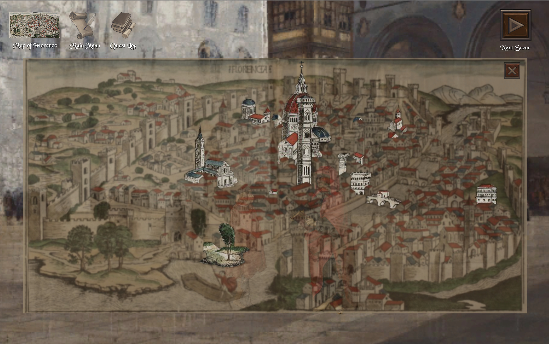
I used pre-made icons for the HUD's main menu, quest log, and next scene buttons. Lots of the buttons and UI backgrounds are made with Classic RPG GUI materials. The Map of Florence, however was made with a real 1493 map as its base.
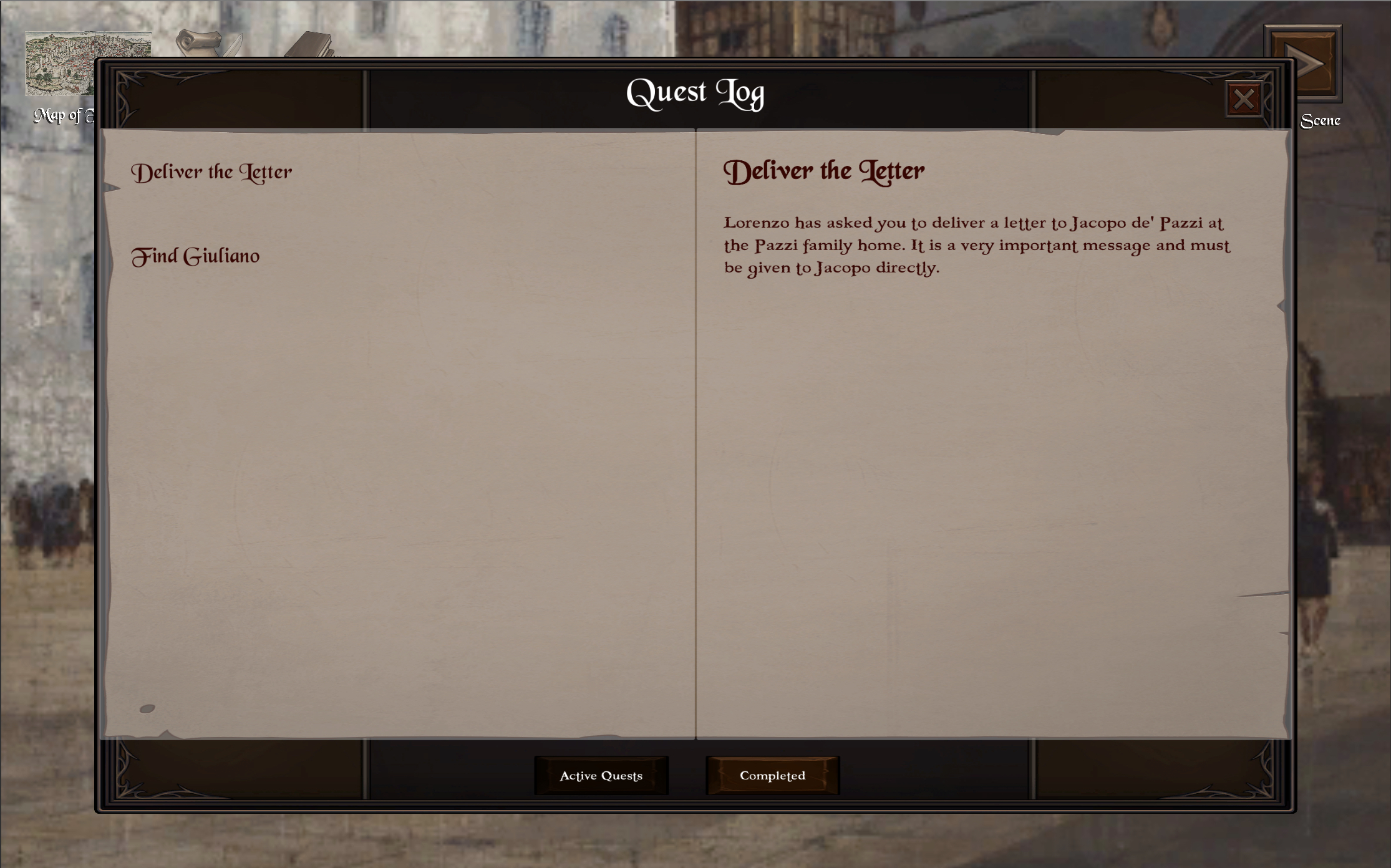
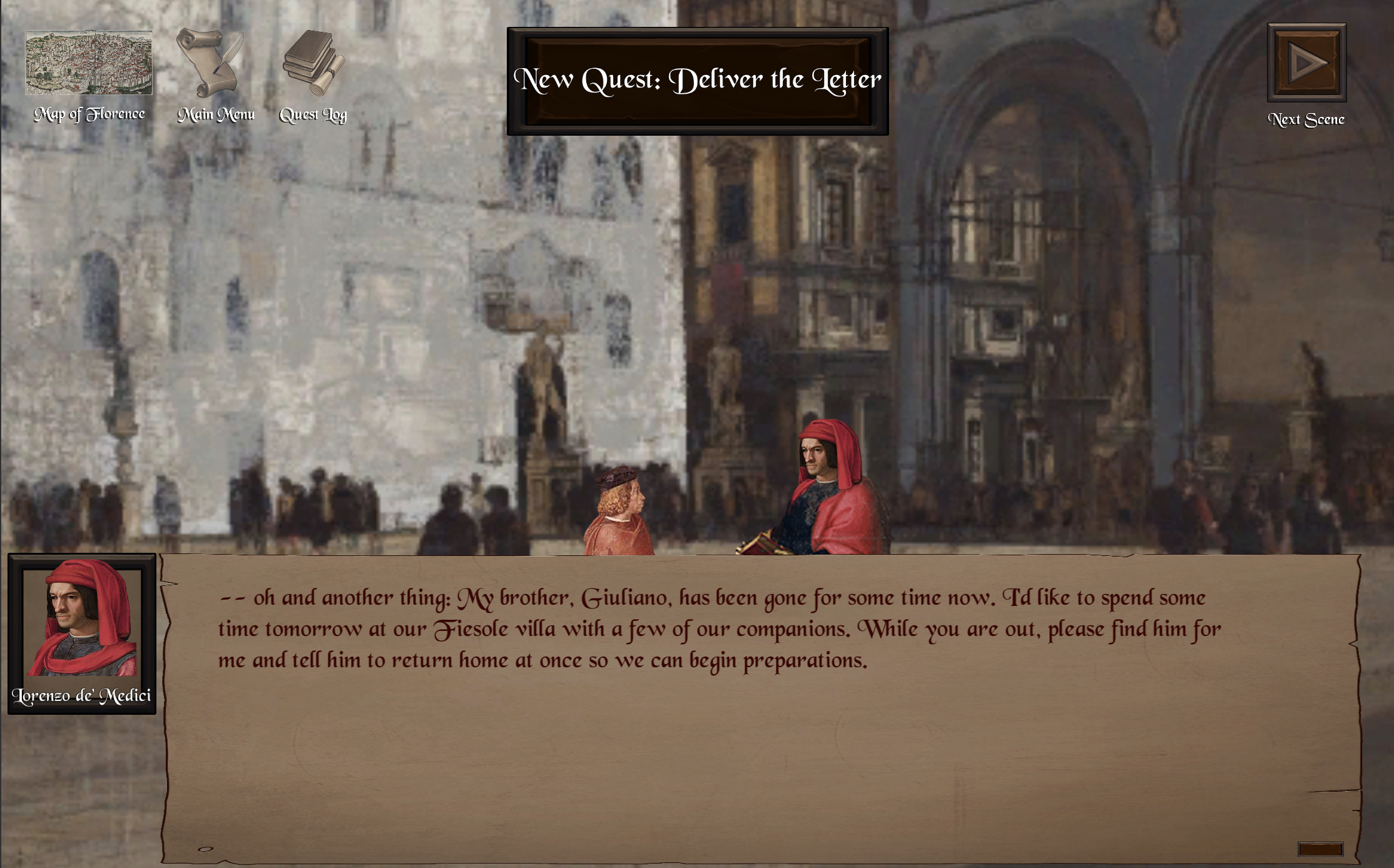
The Quest Log and the UI for the dialogue is made from a combination of Classic RPG GUI materials and pre-made PixelCrushers menus. PixelCrushers' pre-made menus are pretty ugly because you're sort of supposed to customize them. I did some rearranging with the format of the menus to made them more user-friendly and better fit the goals of my game, and I swapped out the art, but the functionality is mostly the same. I'm not totally happy with this part. For example, the font size could be bigger and the text's position on the screen could be tweaked for readability, but I'm glad to have them at least 80% done because it makes the game feel a lot more put together.
Overall, I'm happy with the look and feel of the game. The game looks so much more polished and complete when the UI is well-themed, and it actually gives me a lot more confidence working on other parts of the game now that it doesn't *look* like an unfunctional mess. It isn't quite there anymore, but the functionality still needs a lot of work.
Leave a comment
Log in with itch.io to leave a comment.