Visual Overhaul
While Beta testing has been underway, I have been making major updates to the game from behind the scenes. The game has had a pretty big visual overhaul this week, which makes it feel 10x better to play even if there hasn't been a ton of changes to the game itself.
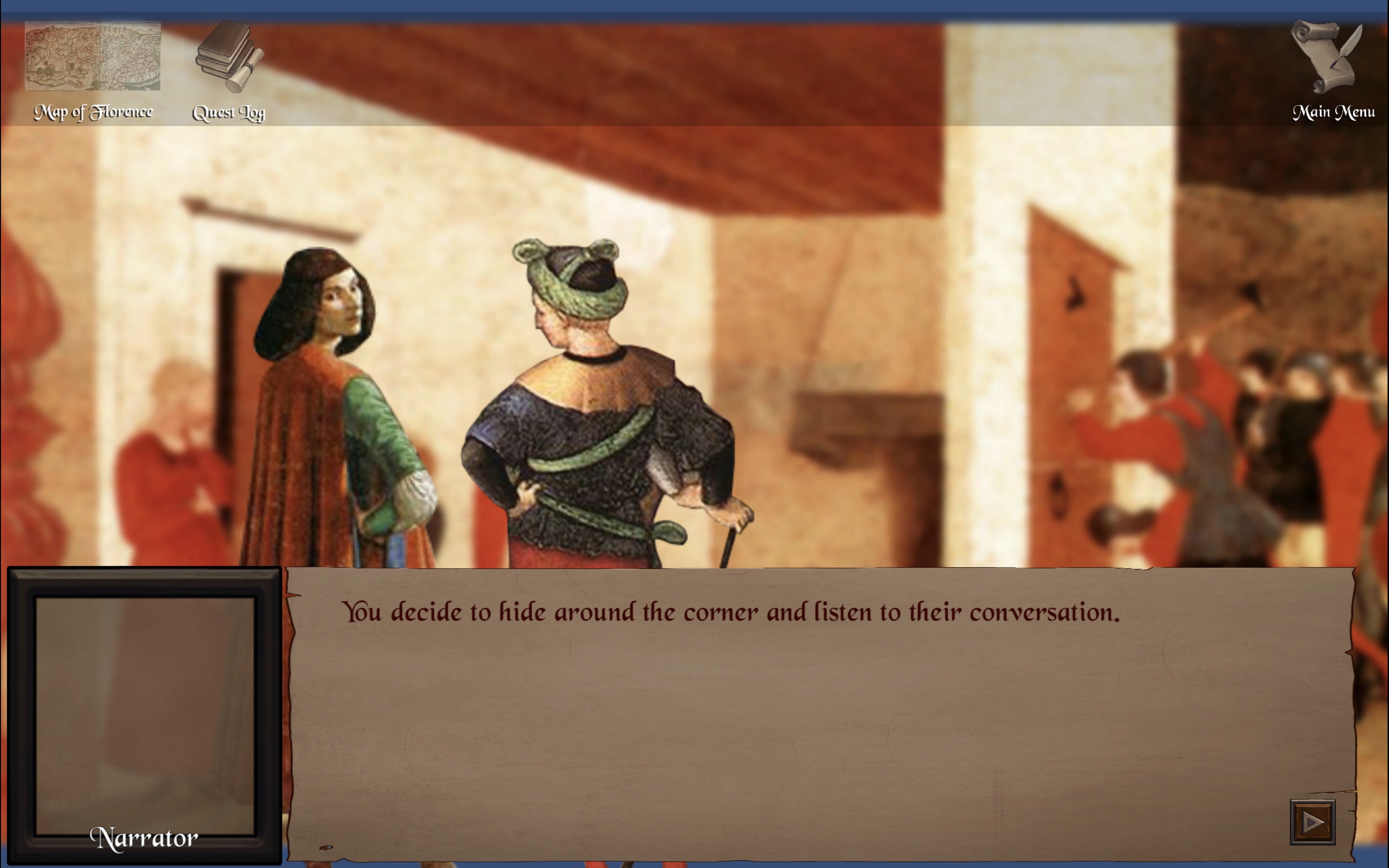
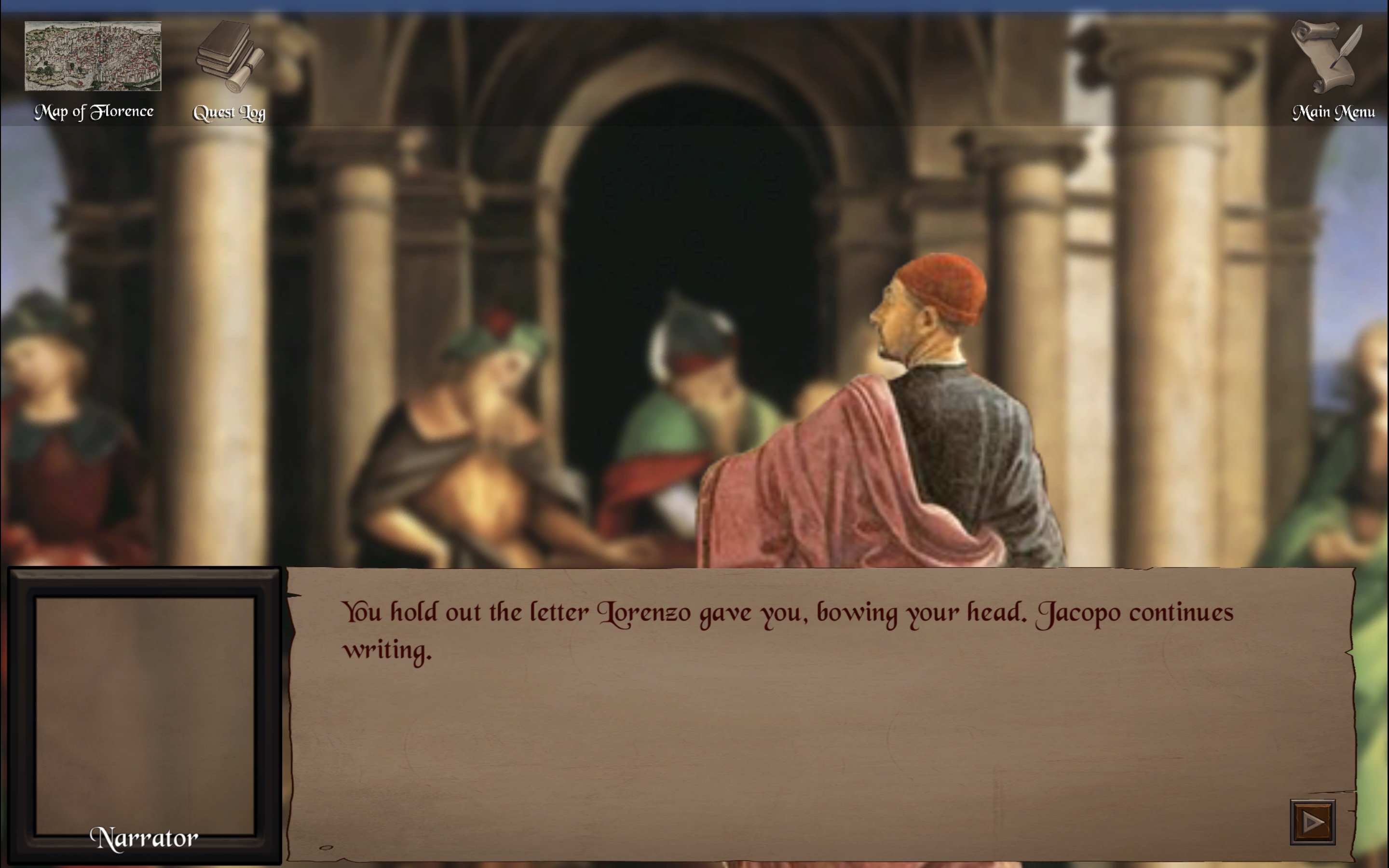
Let's start this conversation with the backgrounds. They are one of the biggest challenges I found with this game's art. I originally wanted to the backgrounds to meet a few requirements: 1) They had to be real paintings from early Italian Renaissance, 2) they had to resemble the area I was trying to show in the game, and 3) they had to be relatively plain with few figures obstructing the view.
Based on hours of searching around digital archives, I now know Renaissance paintings simply don't meet the second and third requirements. They can often be inspired by real places, but the architecture is idealized and the scenes are littered with people. There just aren't clean paintings of Italian banking offices and bedrooms, the inside of the Florentine Duomo, the Piazza della Signoria, etc.
I have been using modern art as stand ins up until now, but I recently made a big shift. Dr. Clulow suggested I use Renaissance paintings but blur the background. That way, they can just suggest a fuller world without giving a ton of concrete details. This saves me a huge amount of work, and I think the new backgrounds add so much color and depth to the scenes.
Below you can compare the exact same line of dialogue in Level 1 across two versions of the game.


Next, let's take a look at the changes to UI.
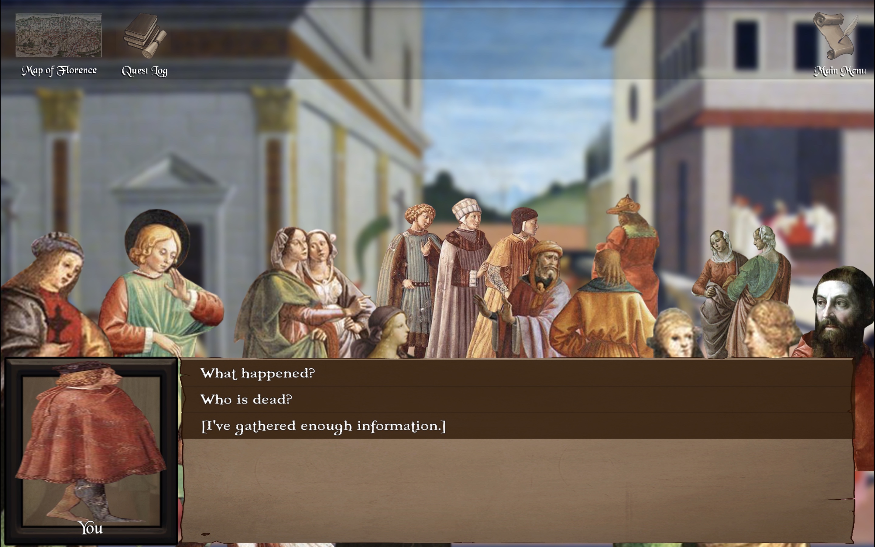
You may have noticed that the user's HUD (head's up display) is different.
First, I completely removed the Next Scene button. I needed that button when the game was too buggy to be fully playable because I needed to get from scene to scene even if parts of the game were still broken. But now the game is working mostly as it should. Players can complete every level by using they map and advancing the story through conversation. If they get stuck now it is part of the gameplay experience rather than a result of poor design.
I also shifted the Map of Florence and Quest Log to the far left and moved the Main Menu to the right. I did this to group together the two tools at the player's disposal during gameplay. They will need the map and the quest log while they play. They will only need the Main Menu button when they get stuck, so I put it somewhere intuitive yet out of the way. I added a transparent black banner across the top of the screen to draw subtle attention to the icons.
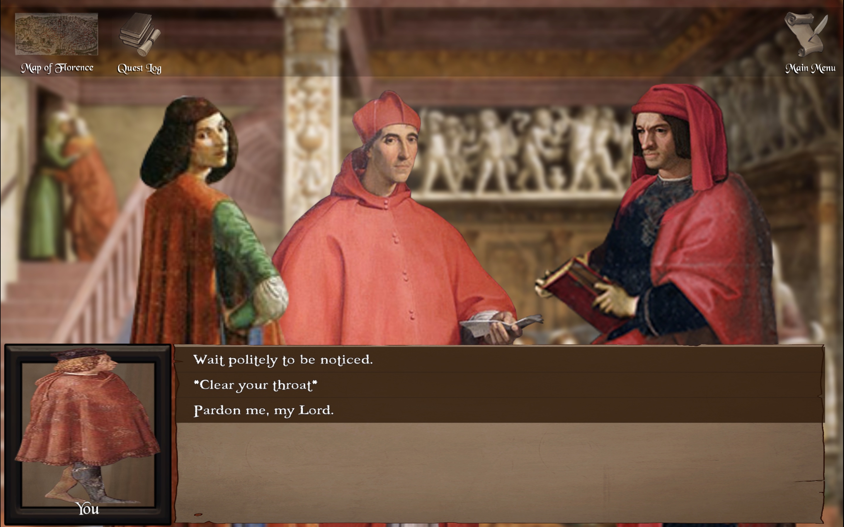
I got some really good feedback about the dialogue box. For older players (and likely for young players with visual impairments or small screens) the dialogue was too small. It needed to be easier to read overall, so I just made the whole box bigger and upped the font size. The whole game takes place in that text box. People need to be able to read it.
After more Beta feedback, I also decided to make the portrait box bigger and increase the font size for the speaker's name. This side of the dialogue box is really important for teaching students who is who. There are a lot of characters to keep track of, and they all have long, intimidating Italian names, so I want to make them as accessible and easy to digest as possible.
There are still plenty of changes to be made for the visuals. The top of my to-do list are to 1) make sure every NPC that is currently a floating head gets a body, and 2) make square portraits for everyone to go in the portrait box so they don't look squished anymore.
Leave a comment
Log in with itch.io to leave a comment.