HW1: Level Layouts and References
Intro:
This post marks the beginning of my design process for a homework assignment in AET 334C: Level Design. In this class, we are each being asked to create a 3D level in Unity by ourselves. Through this dev blog, I will discuss my process for creating the level at every stage of the project.
Our first assignment has us outline the basic concept for our levels. I'll walk you through the environment and basic narrative concept, my photo inspiration, and the early ideas for the level map.
Research Questions:
Where is the level?
- a meadow that has become sick and evil
What does it feel like?
- fake; lovely to the point of suspicion; unsettling; something is not quite right
Why is the player there?
- to return the meadow to harmony by healing (fighting) the evil flowers
Essence Statement:
The level takes place in a beautiful meadow that has turned evil. Everything looks almost too perfect - it feels fake and eerie. Your job is to restore harmony to the meadow by fighting the evil plants and turning them good. This is a single-player action-adventure platforming game for the PC that uses the keyboard.
Mood boards:
We only needed one mood board for this assignment, but it was helpful for me to make separate boards for different elements of the game, so I made three.
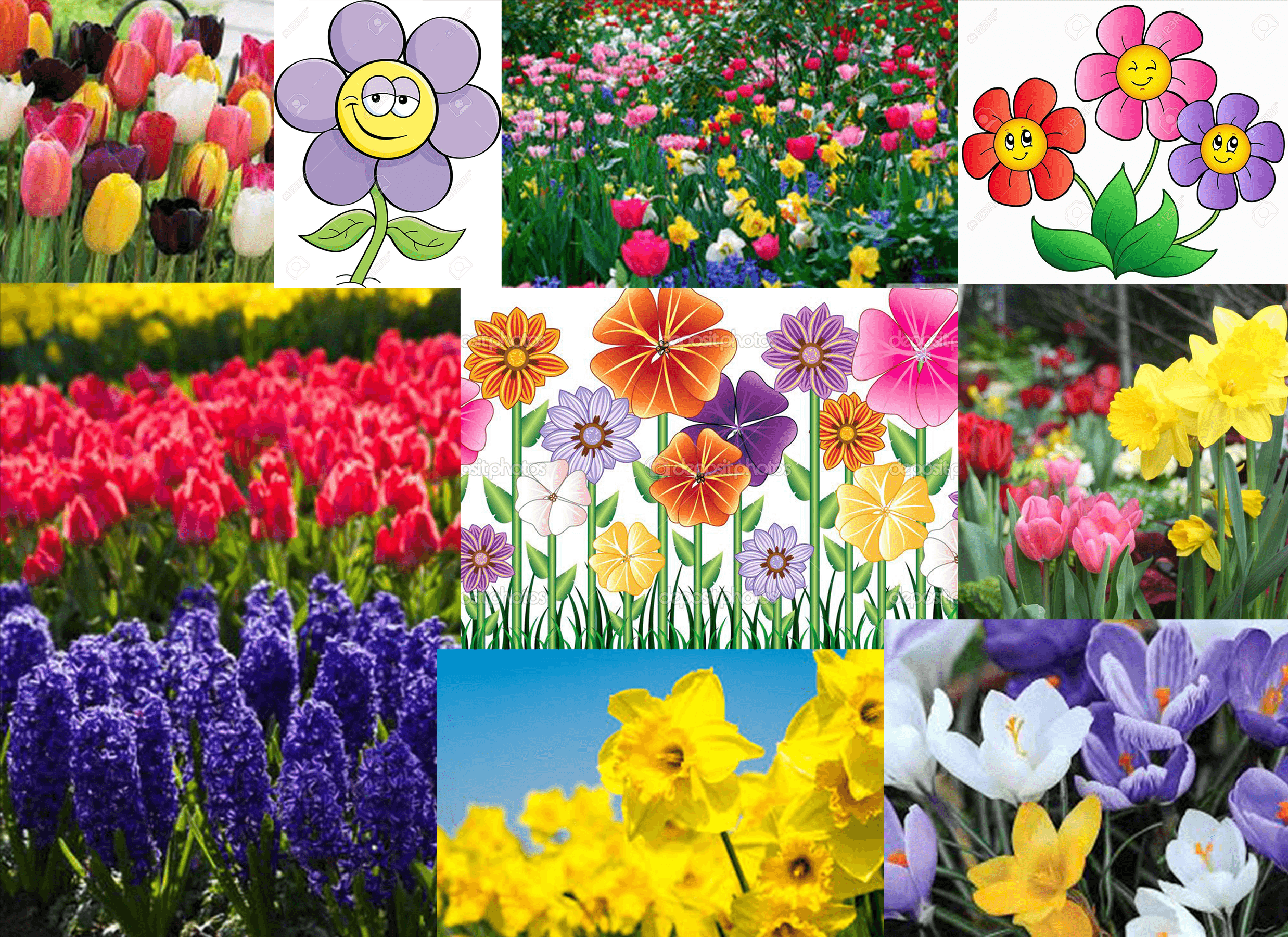
The first mood board represents the meadow when it is healthy and harmonious. This is what the meadow is supposed to be like and what the player hopes to return it to. Springtime flowers will inspire many of the enemies.
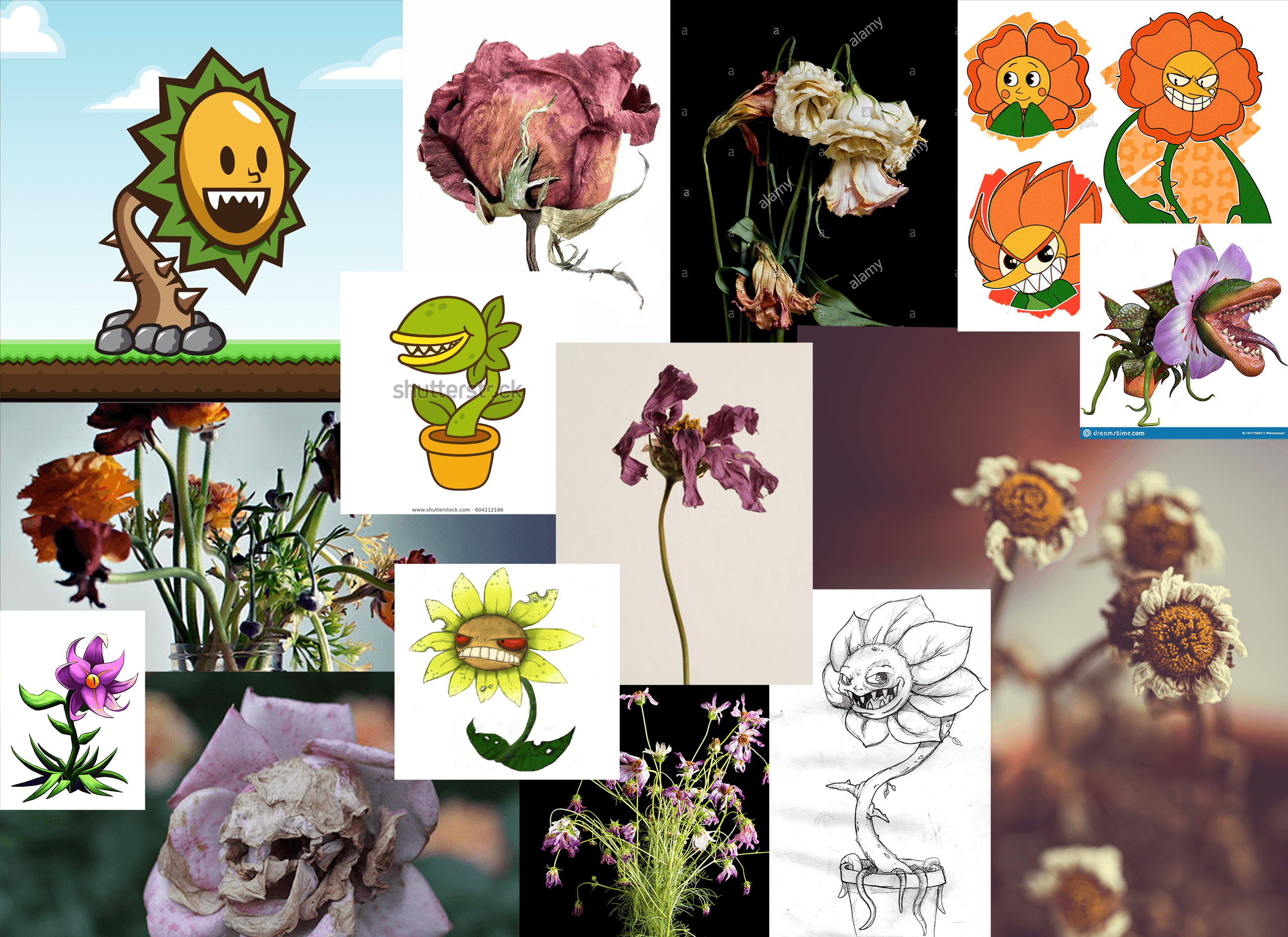
The second mood board is an exploration of what the meadow looks like while sick. I am not sure yet how realistic or cartoony the art will be, so I included images of both in order to compare them. I'd ideally like a blend of the two styles.
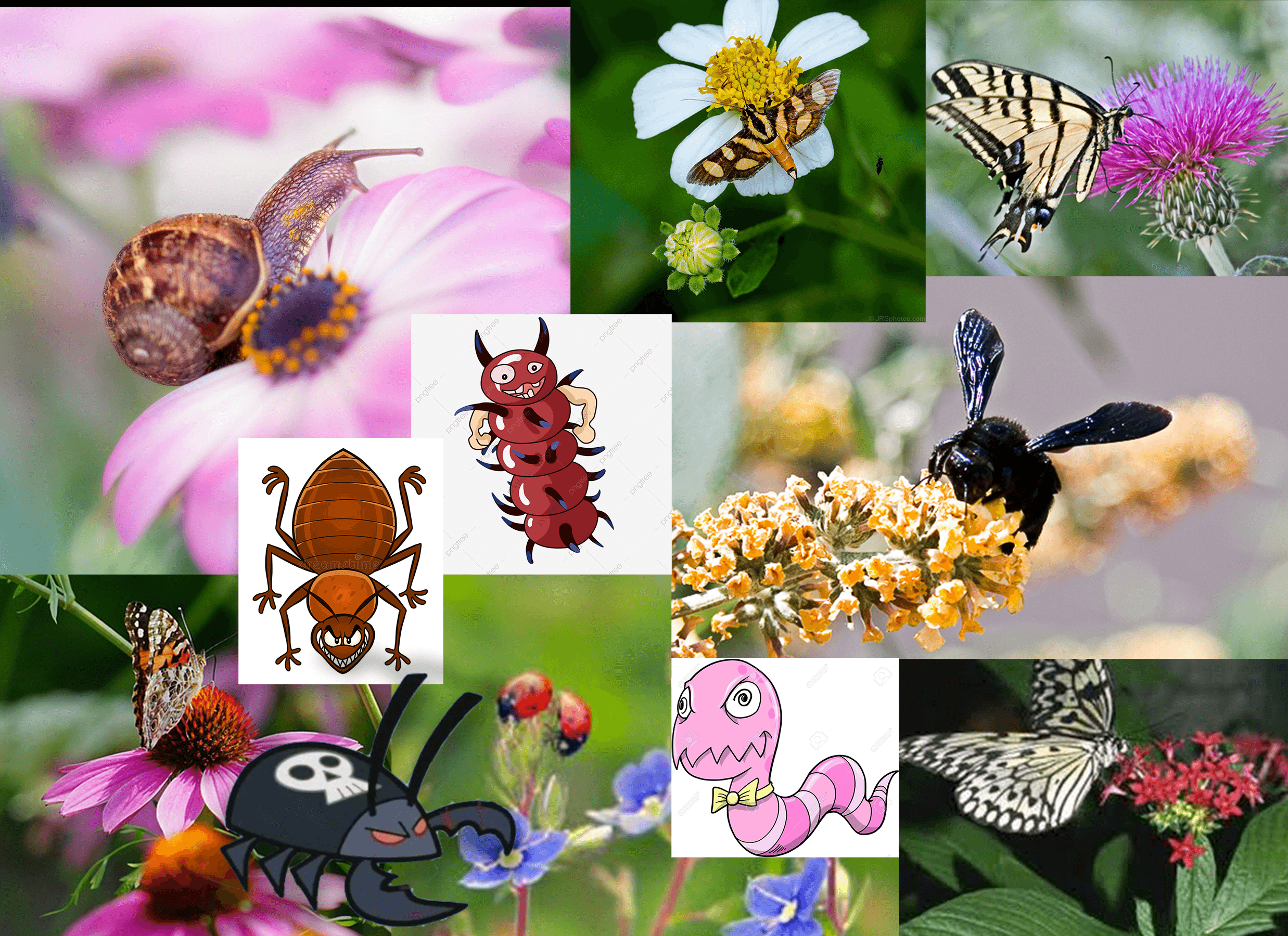
I'm also considering the possibility of having bug-themed enemies. I think I'd prefer to focus on plants, but bugs present an interesting option for mobile enemies, especially flying enemies. This board has images of real creatures that would be in meadows as well as a few cartoon ideas of how one might make them look malicious.
Level Design (early ideation):
For the early level design, I allowed myself to try out any ideas that came to mind, no matter how much or little faith I had in them. I think it's important to test out ideas before dismissing them as "bad." That way I don't pressure myself to be perfect. My goal was to allow myself to explore ideas freely. I tested out 4 ideas for my level.
Idea #1
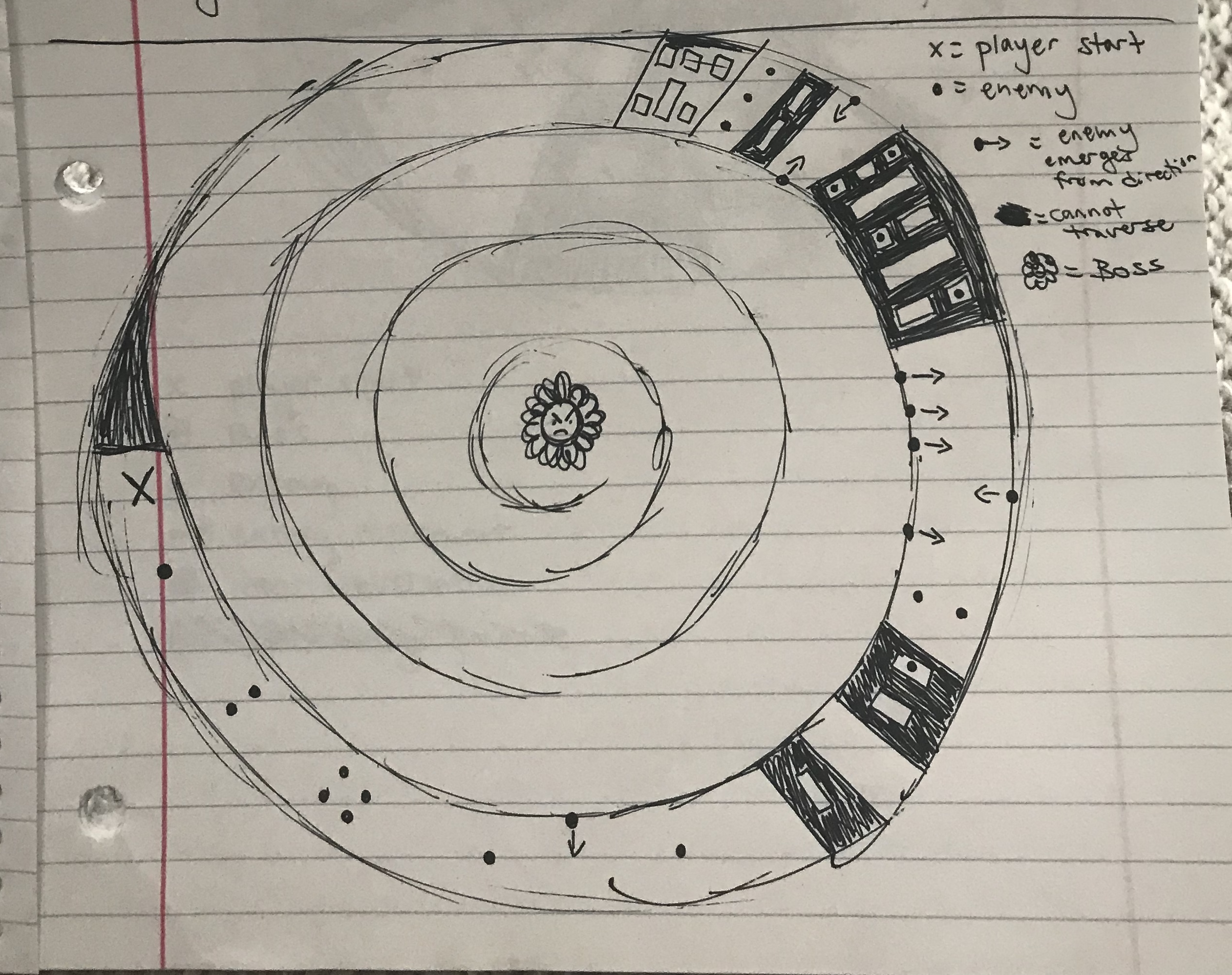
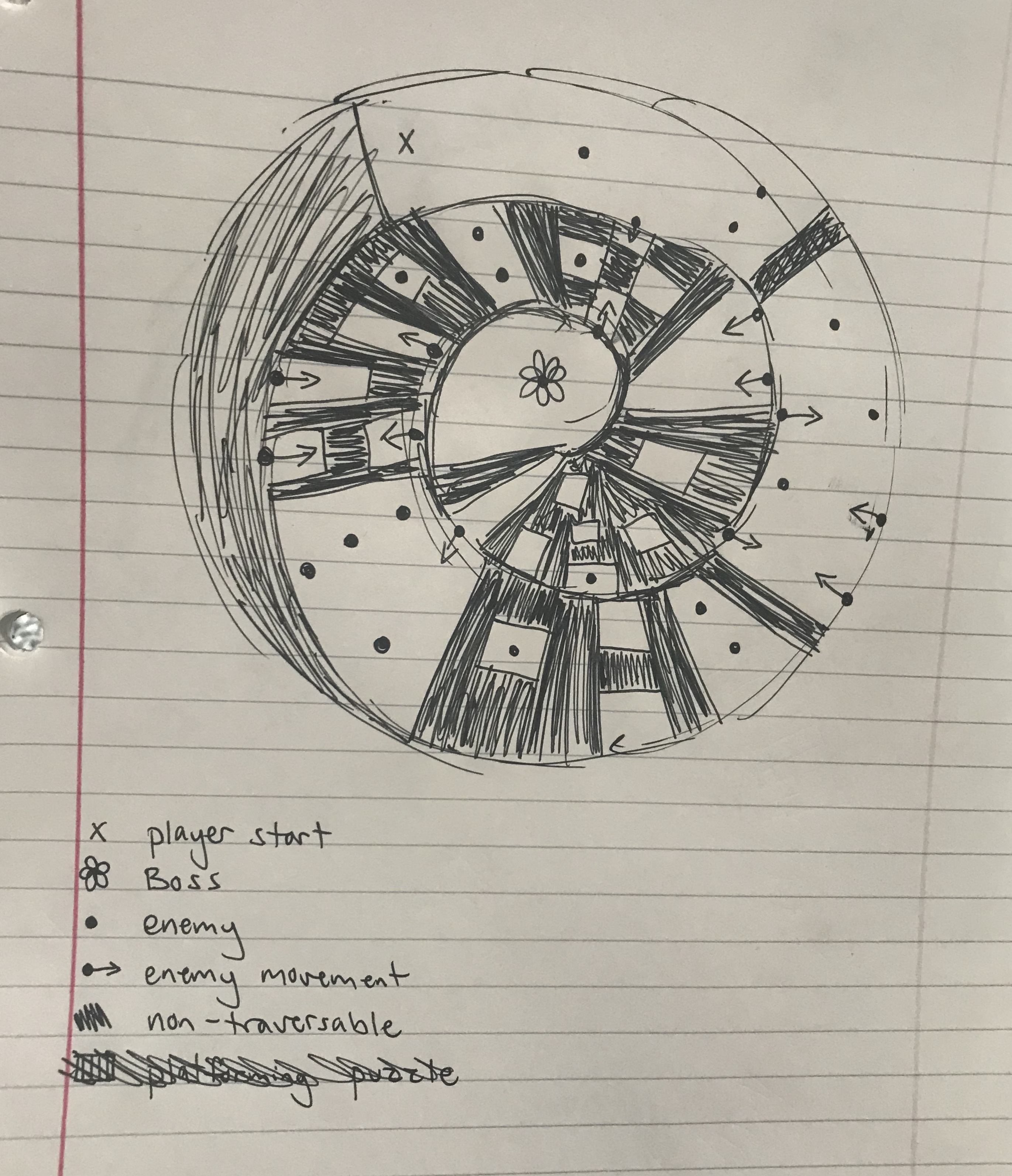
I wanted to put my level on a spiraling mountain where the player started at the base and continually followed the path upwards. The player would learn how to play the game slowly as they are presented with slightly more difficult challenges at each stage. First, the player would take on one enemy, then two, then several. Next, they would encounter a new kind of enemy that emerges from the side of the mountain. Then they would be introduced to simple platforming. Eventually combat and platforming would be combined, and both would grow more challenging over time. The final challenge would be a boss battle where the enemy has all the capabilities of the other enemies combined.
I used this first try to test out my basic ideas for platforming and enemy placement, but I realized I had made the map too big to entirely flesh out on my first go, so I switched to a smaller map.
Idea #2
This map is a smaller version of my first idea. I wanted to more closely explore the combination of enemies with platforming here. The map is smaller so I could be more intentional with the placement of objects rather than worrying about filling up a huge drawing so it would look "done."
Idea #3
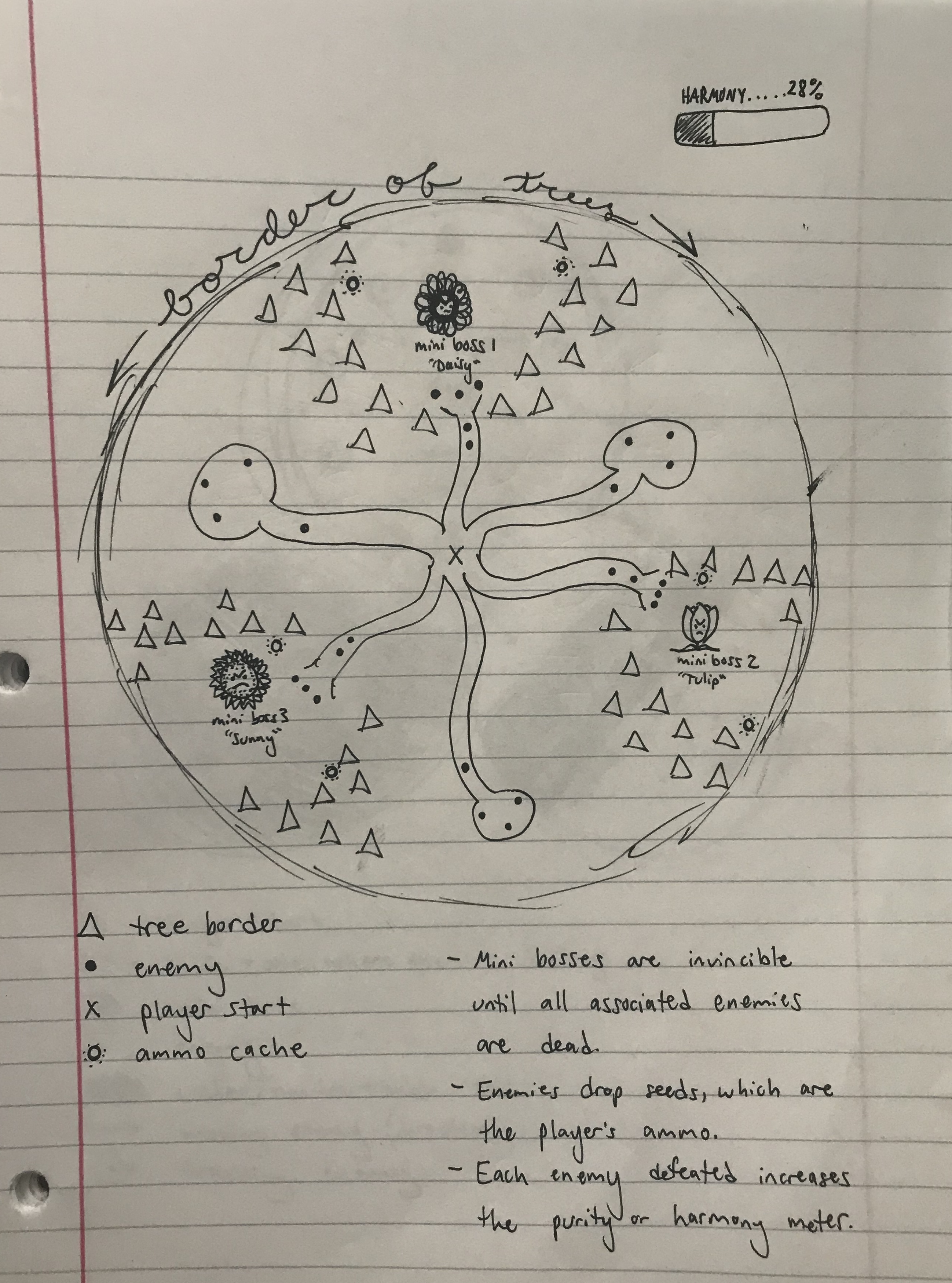
Just to try something new, I pushed myself for my next drawing to try a more open-world style map. The map is a finite space, but the player gets to decide where to explore and which enemies to fight first. Each area of the map would have a different theme for enemies.
I didn't like how much blank space was in this map due to its circular shape, and I still felt like I needed to incorporate platforming challenges. That led me to my last idea.
Idea #4
Here I focussed on making each of the three areas distinct from one another. The player can still choose which area to take on first, but there isn't any miscellaneous space without a boss attached. This game would basically be three boss battles that are preceded by lower-level enemies and some platforming puzzles.
I don't love the shape of this map. I would prefer to work with verticality more as well.
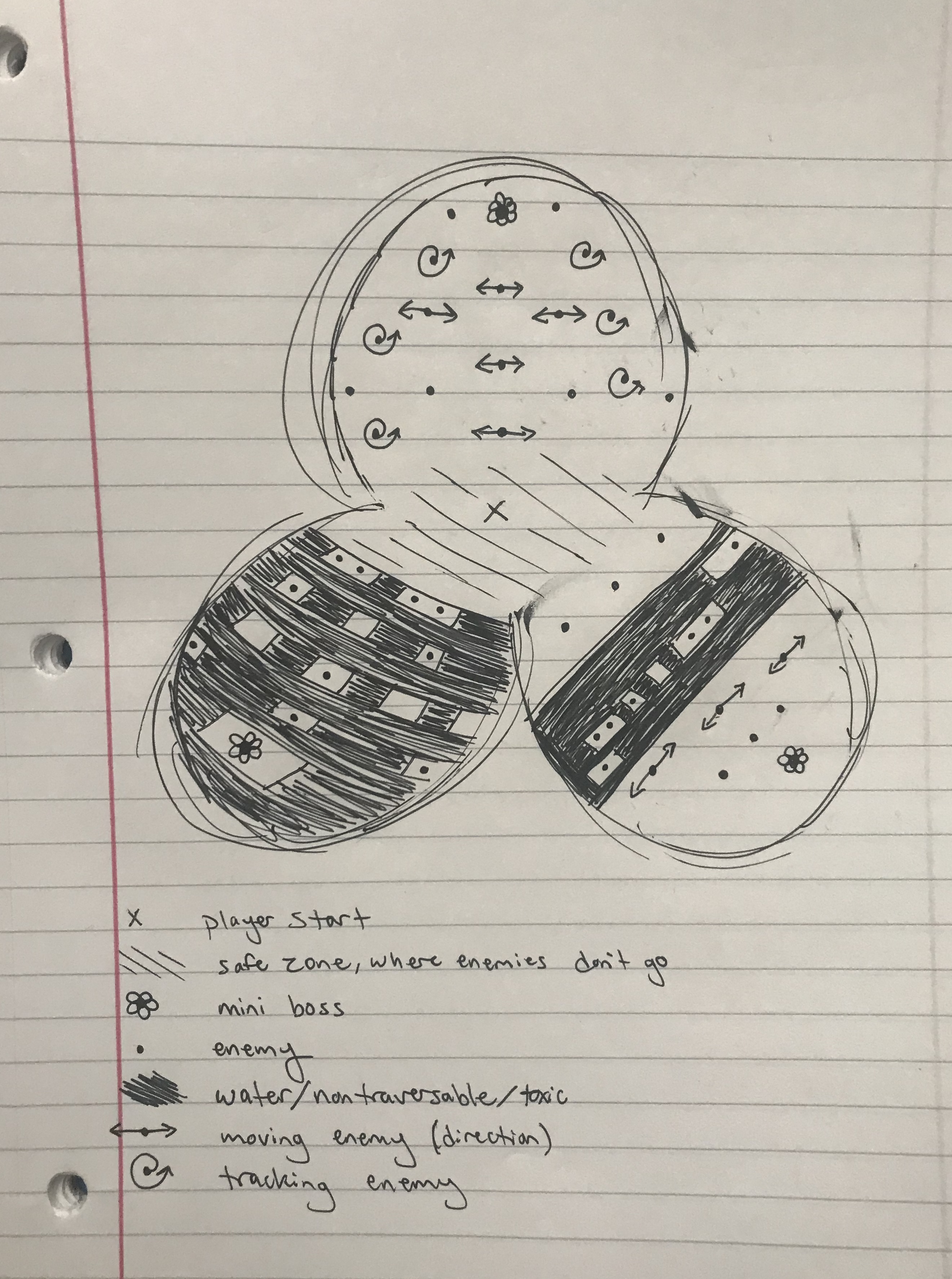
Overall, I think I this process of ideation was helpful for me, and I don't think I'm done. I like elements of all of these maps. I think my next pass at ideation will result in a map with 1) verticality 2) varied enemy types 3) platforming puzzles and 4) only one boss.
Get Betrothed
Betrothed
Meet your betrothed for a secret rendezvous in the maze!
| Status | In development |
| Author | Haley Price |
| Genre | Adventure |
| Tags | 3D, maze |
More posts
- HW4: Playtest Feedback Blog and Gameplay VideoFeb 26, 2020
- A2: Character StoryFeb 19, 2020
- A1: Feedback In-Class ActivityFeb 17, 2020
- HW3: Whitebox Blog PostFeb 10, 2020
Leave a comment
Log in with itch.io to leave a comment.