HW3: Whitebox Blog Post
Description of layout changes from original top-down layout
My original top-down layouts were kind of all over the place, as you can see from my drawings below. I didn't have a clear vision for what I wanted to do for a while, but I finally settled on creating a maze. Once I settled on that and started messing around in Unity, the design came pretty easily.
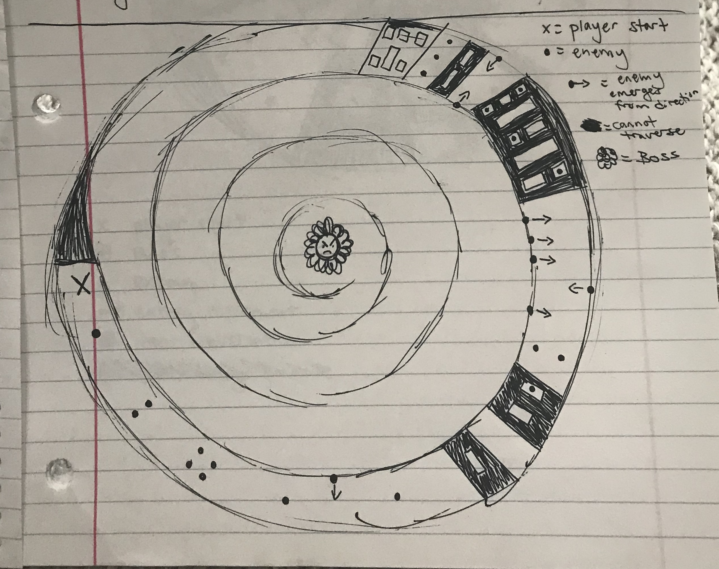
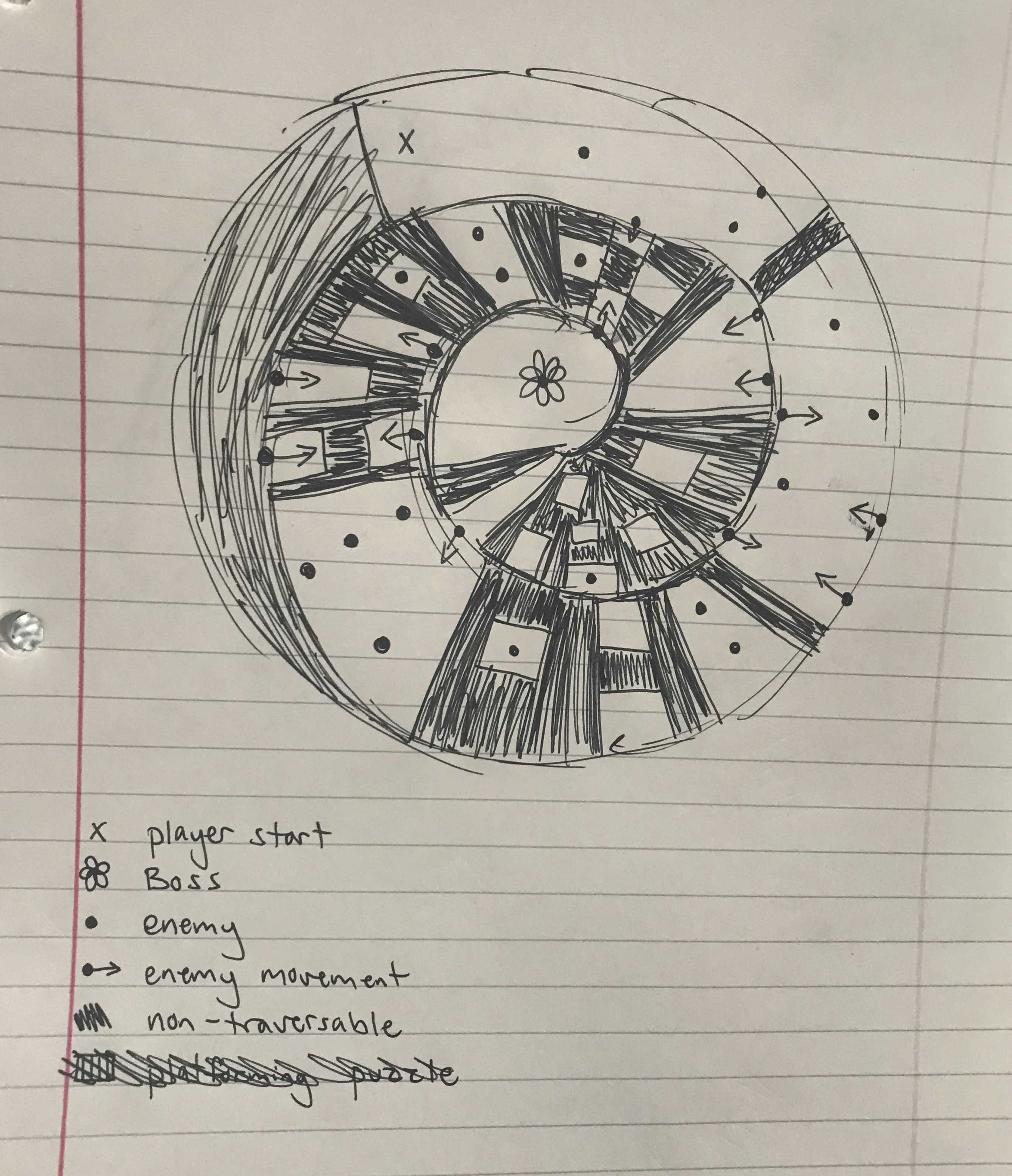
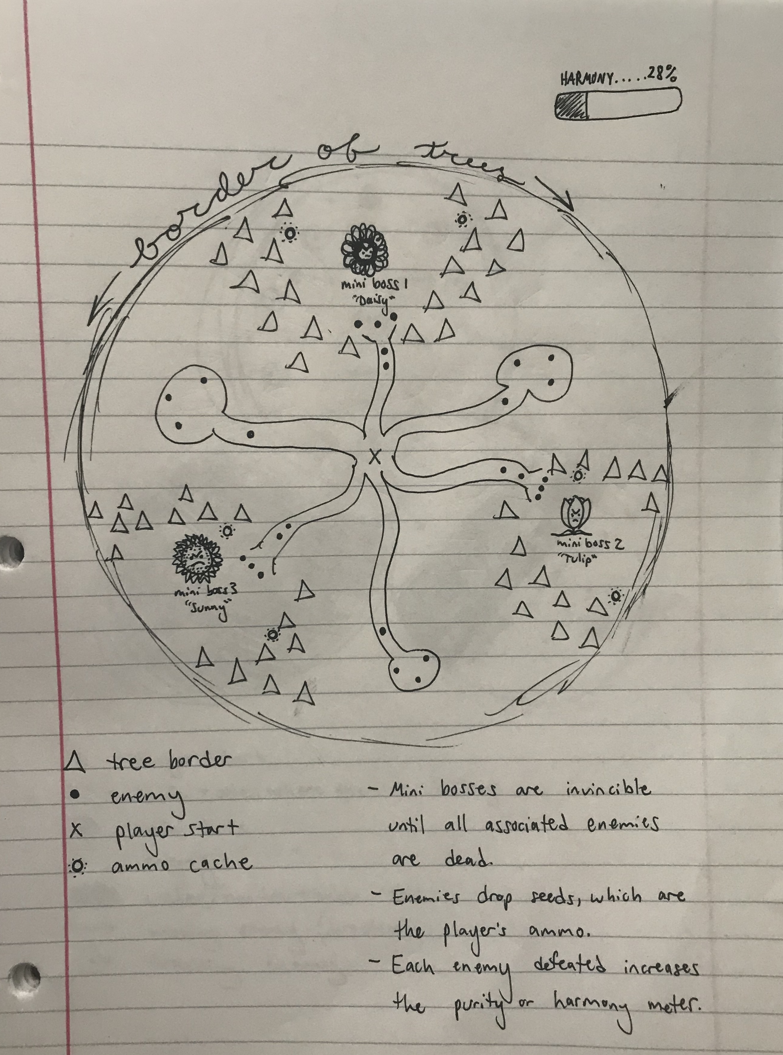
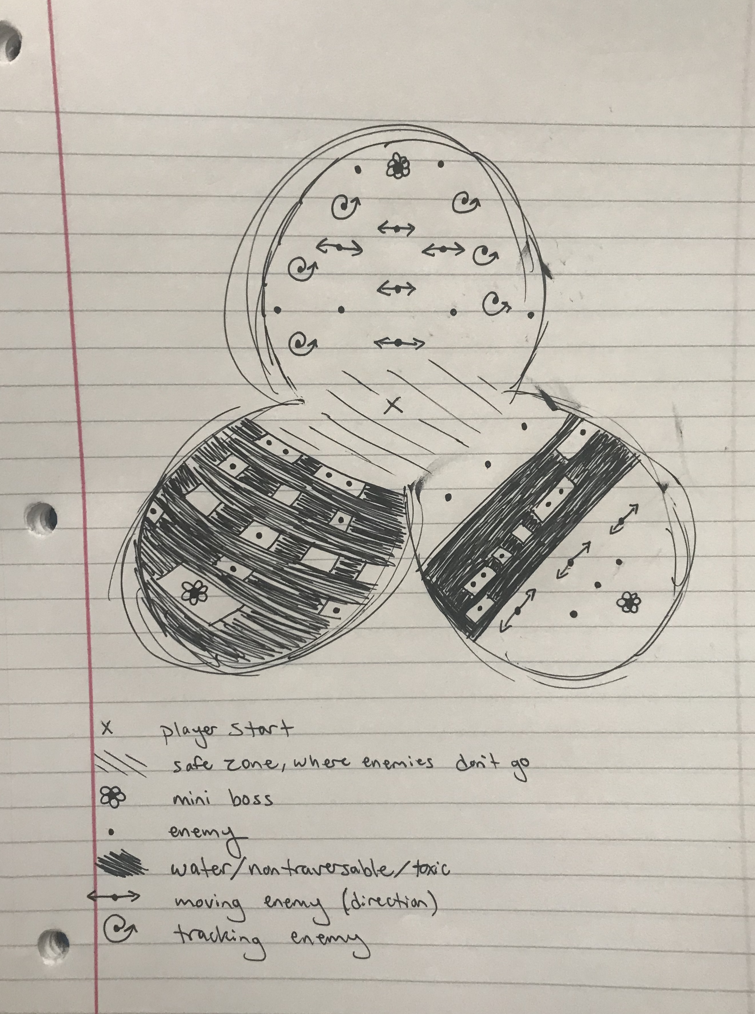
I thought a maze would be much more fun to play (not to mention way easier to build) than any of my earlier designs. I liked the idea of the map itself being part of the player's challenge. Not only do they have fight interesting enemies, but now they also have to navigate a complex map without getting lost, find lost objects that are necessary for progression, and anticipate enemies hiding around corners.
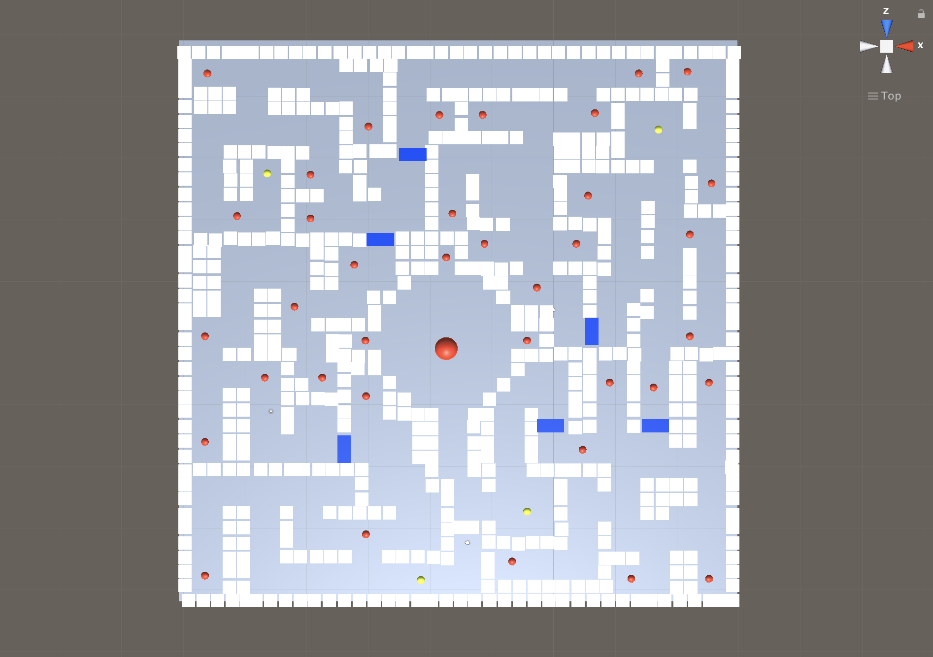
Instead of testing out top-down ideas on paper, I started building the maze in unity so I could easily place, move, and remove walls. I went back and mapped out my level in Photoshop afterwards for my official Top-Down Layout. It also allowed me to mark up where I thought important objects and enemies should go, as well as the player's starting point. Below is the map I was using when we play tested our whiteboxes in class.
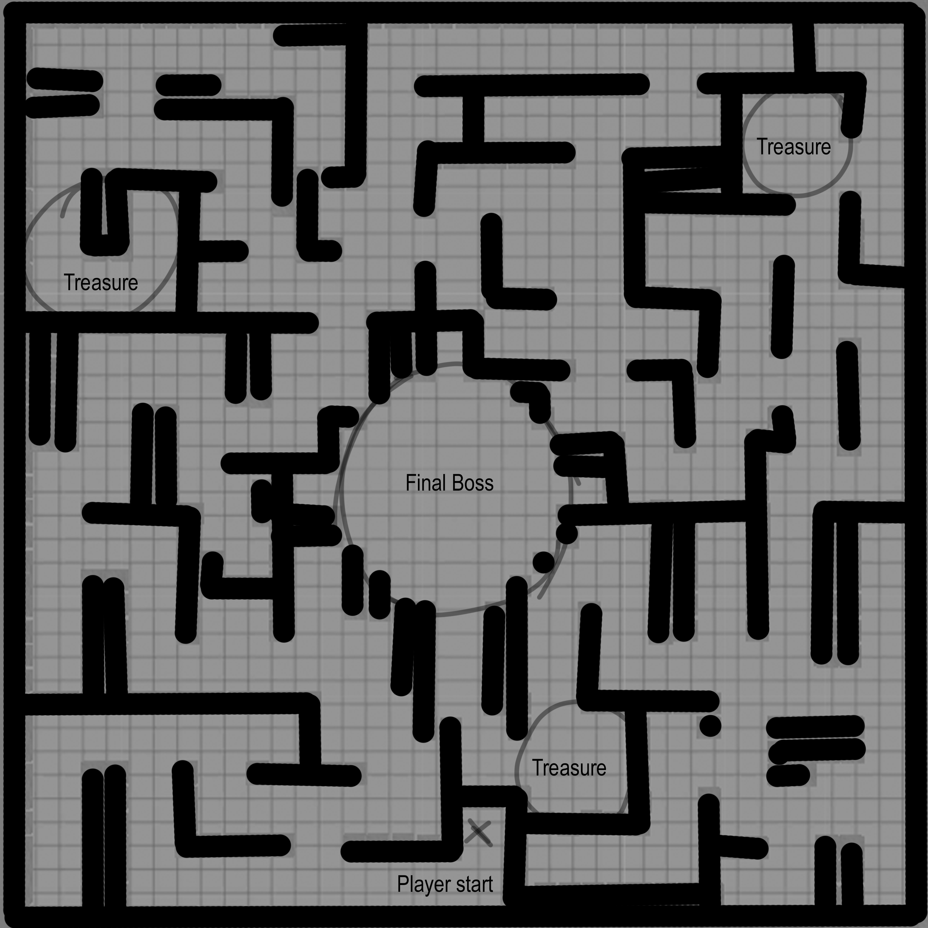
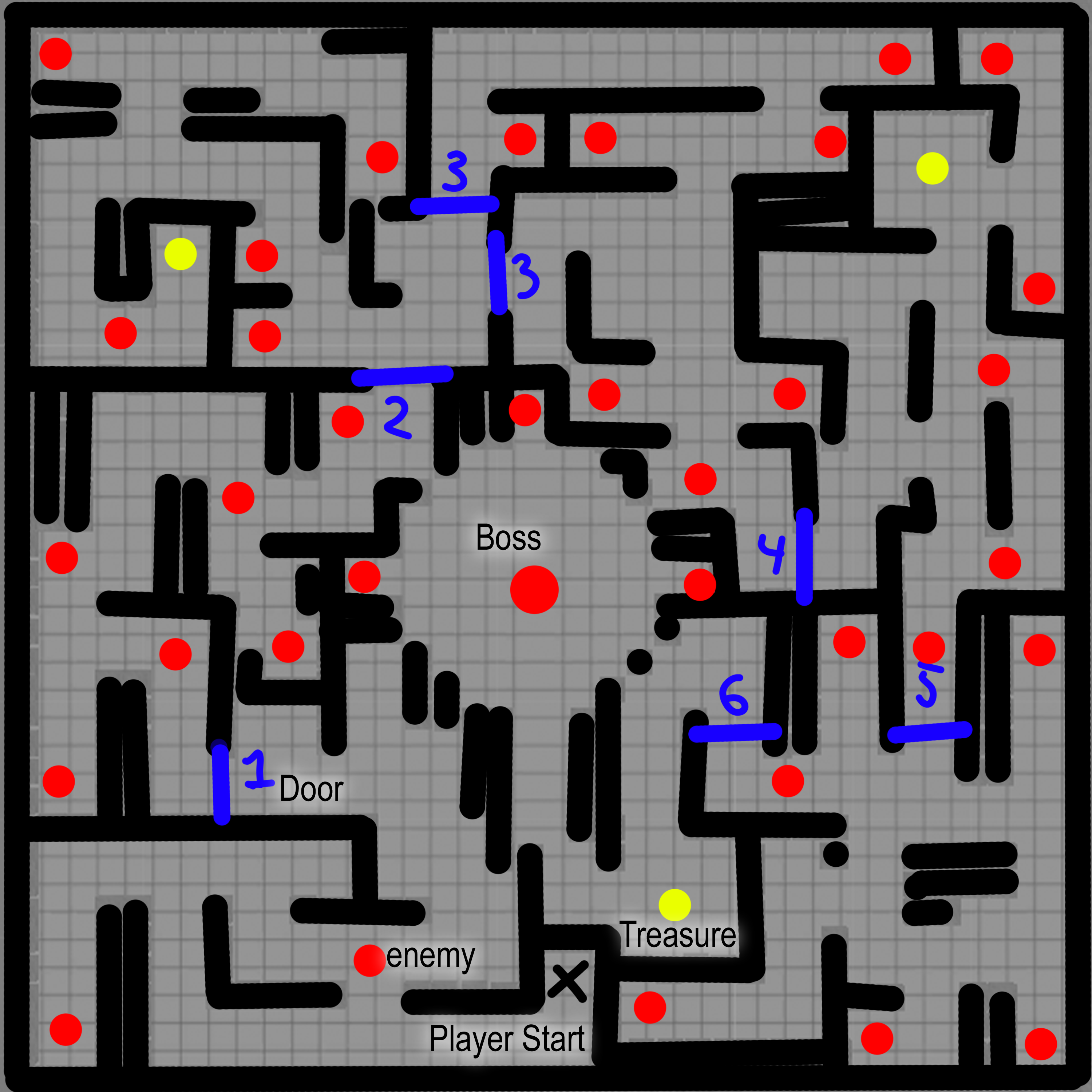
After play testing, I made a few changes and ended on the version of the map you see below. I'll explain all the changes in the following sections.

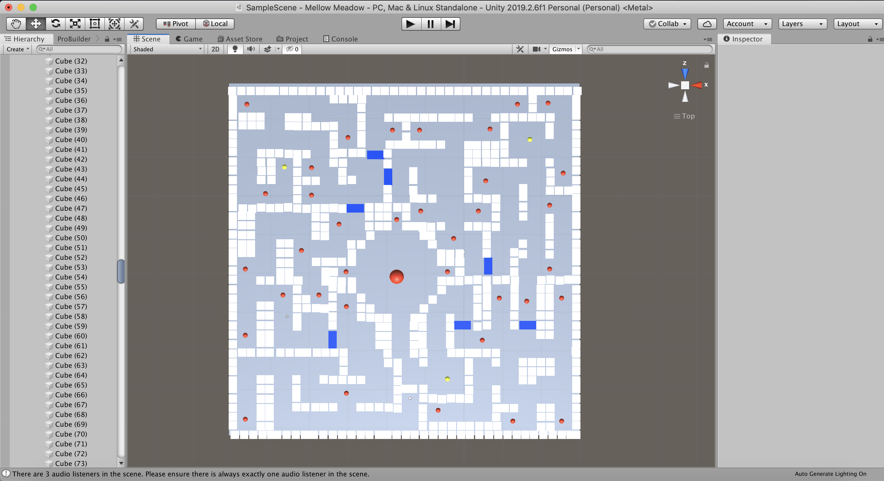
Before and After screenshots of whitebox
Before:
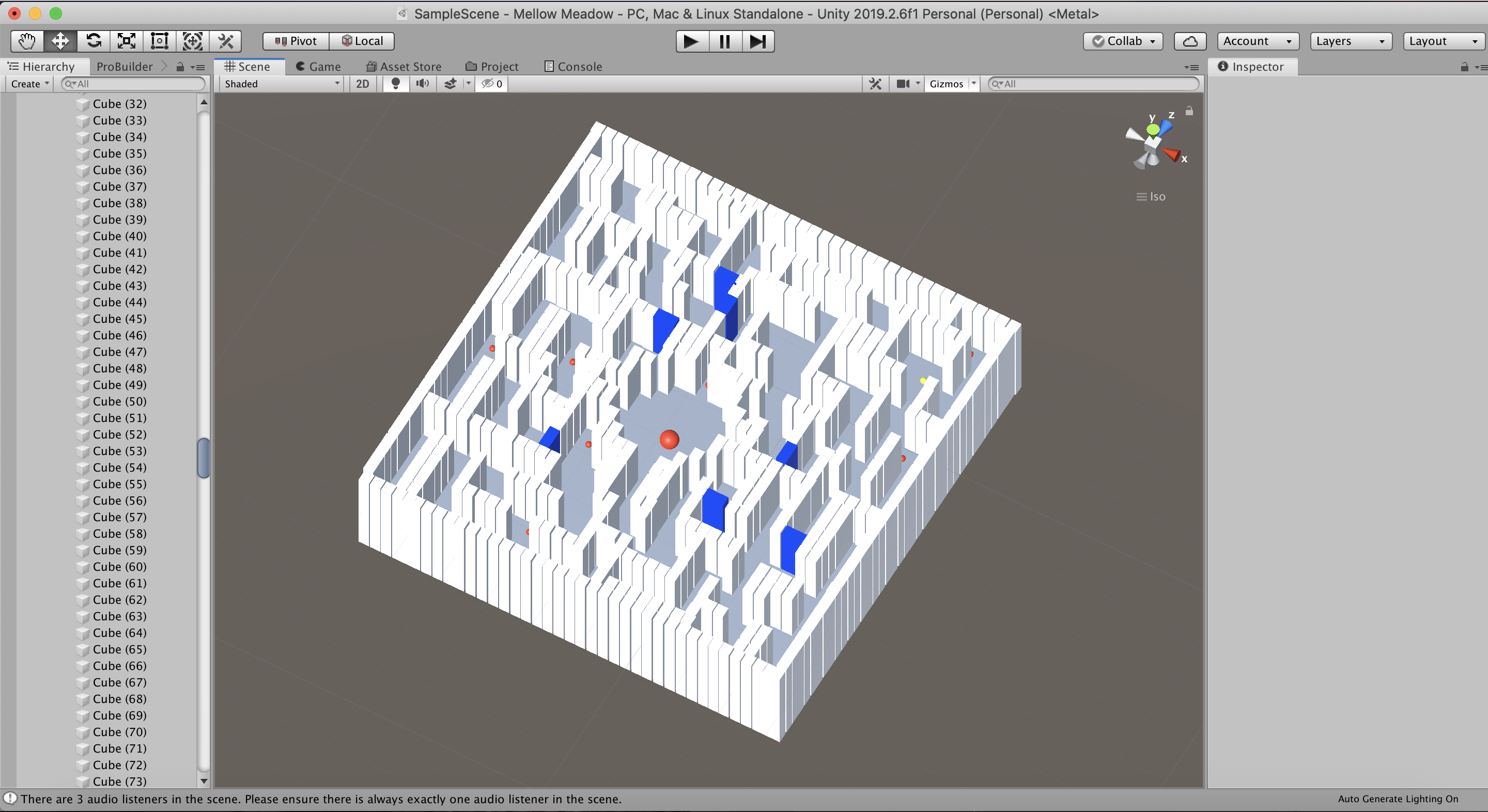
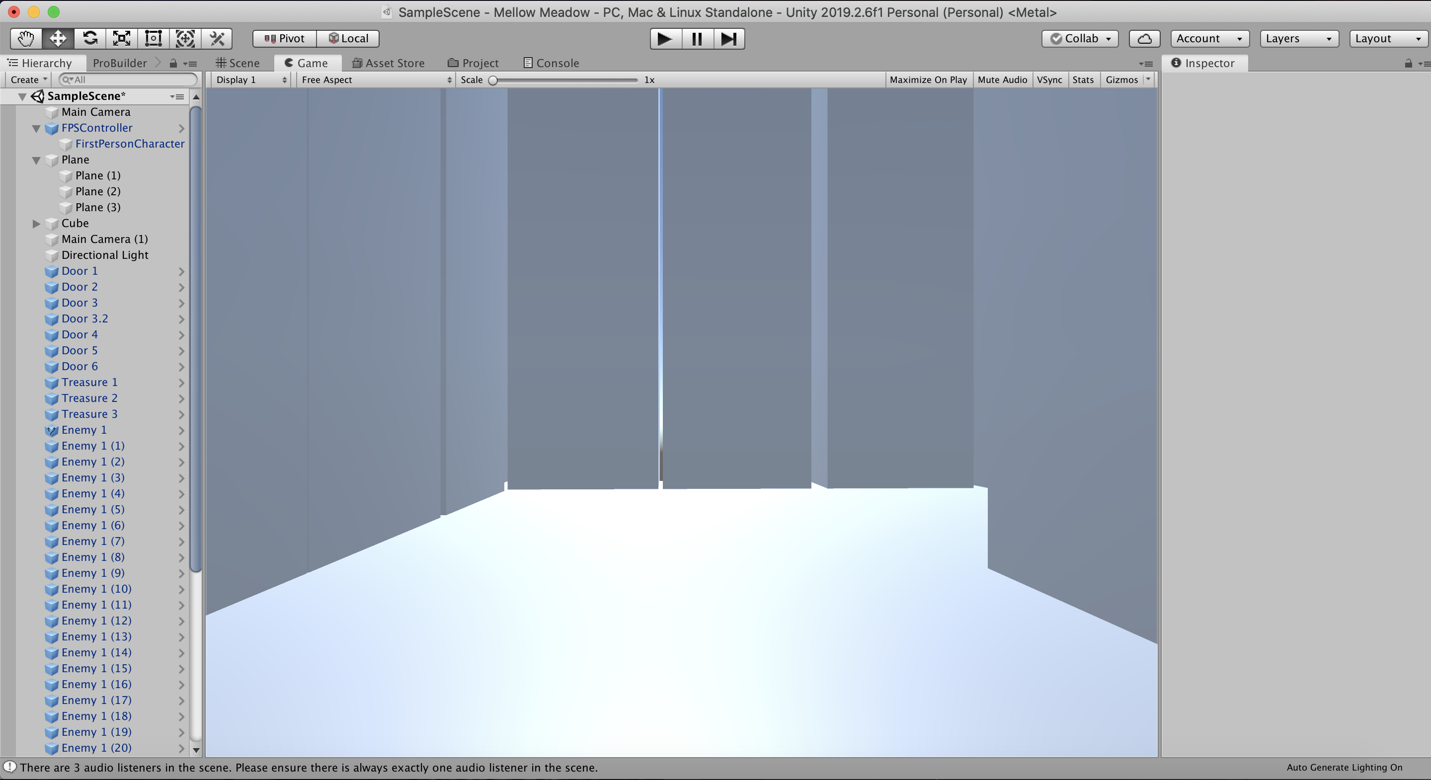
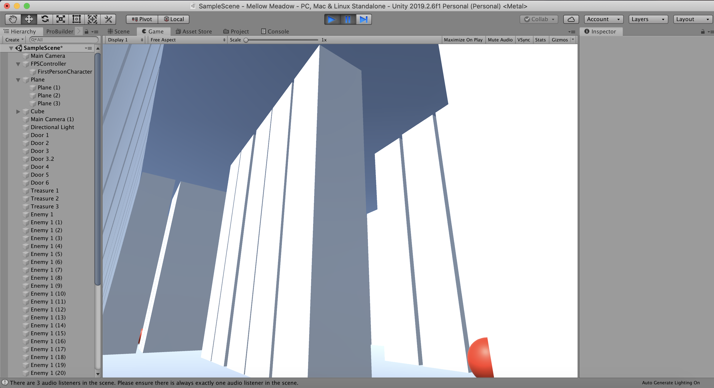
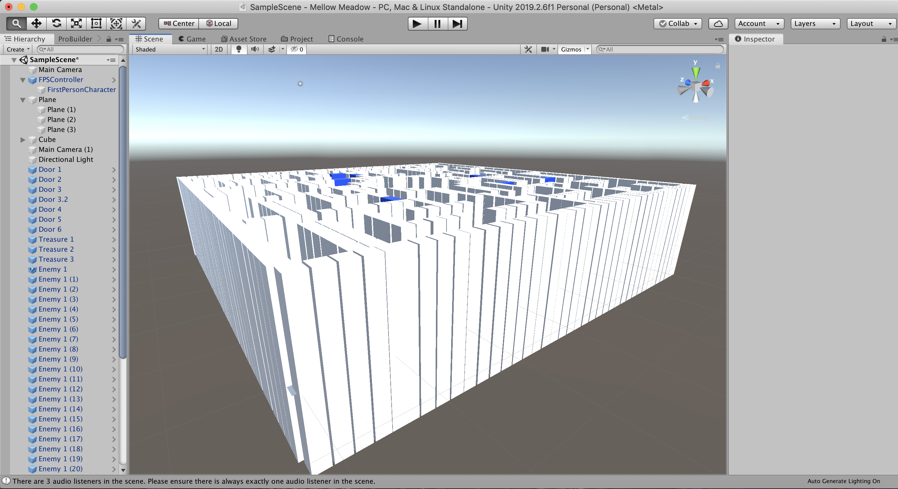
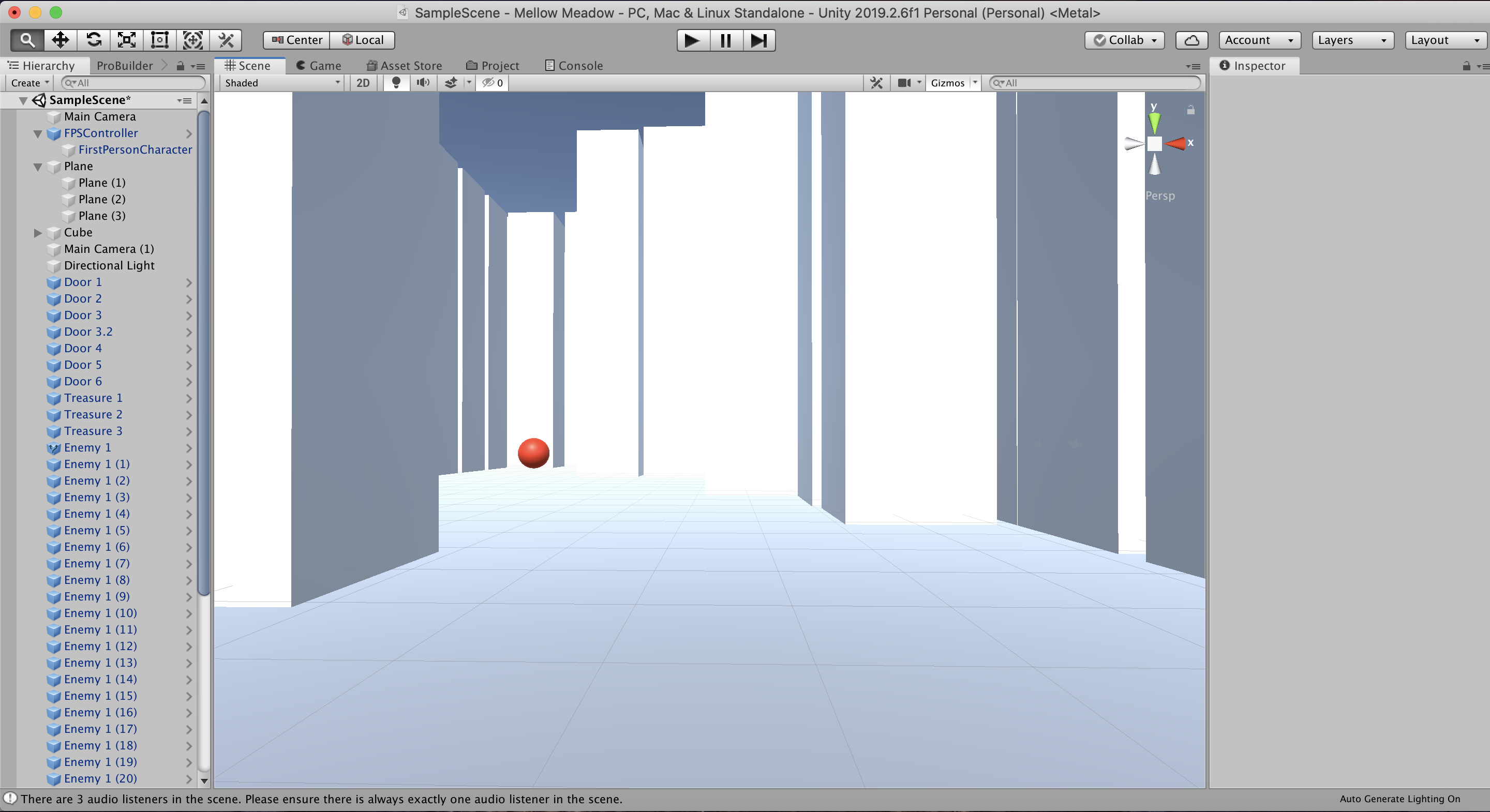
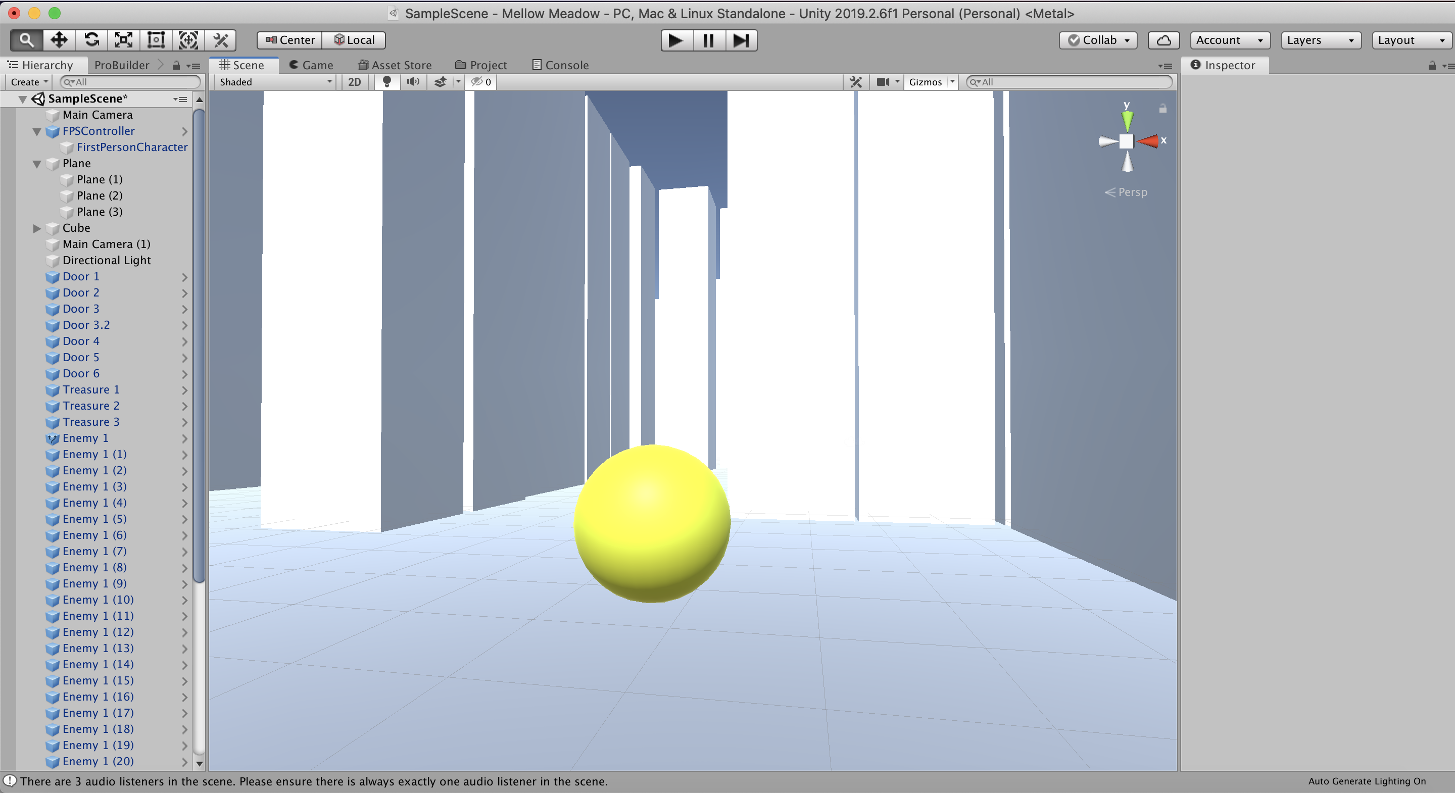
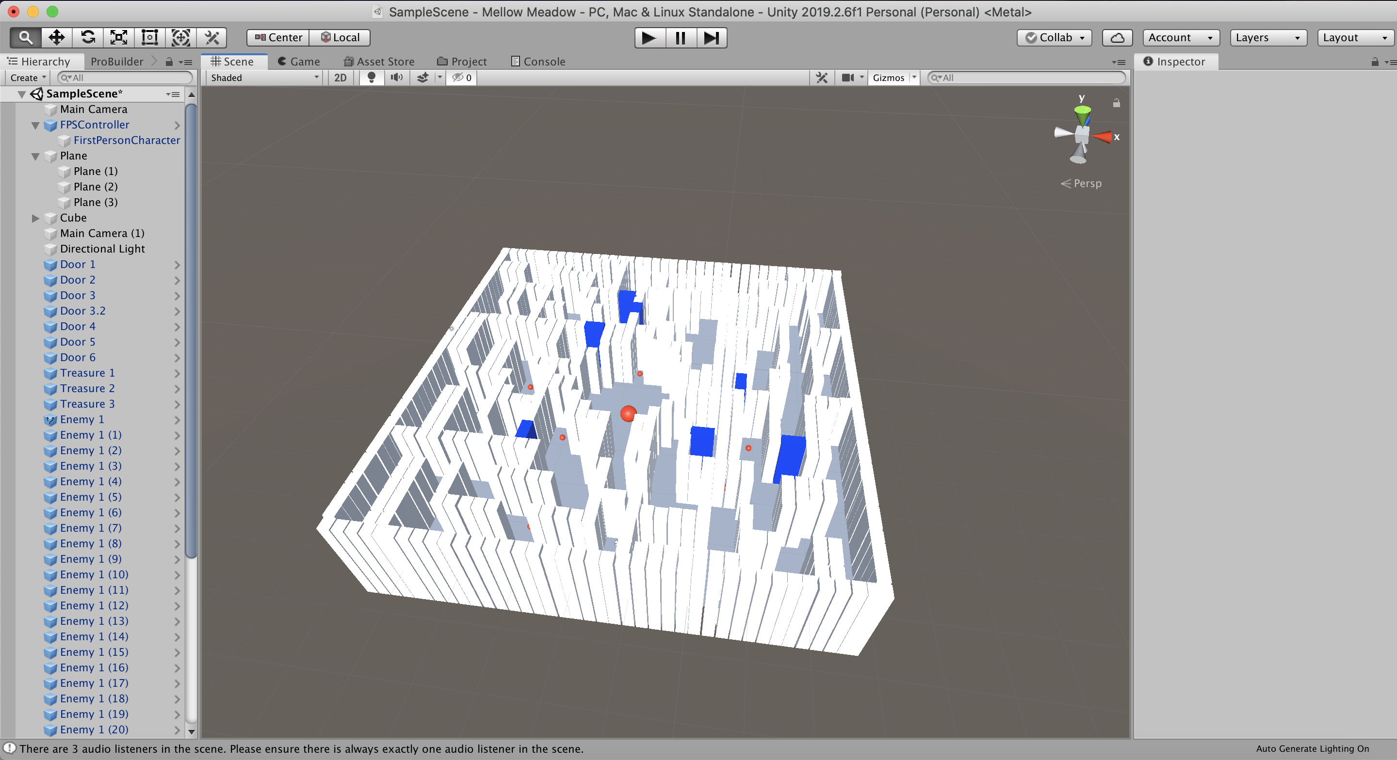
After:
List of feedback received during playtest
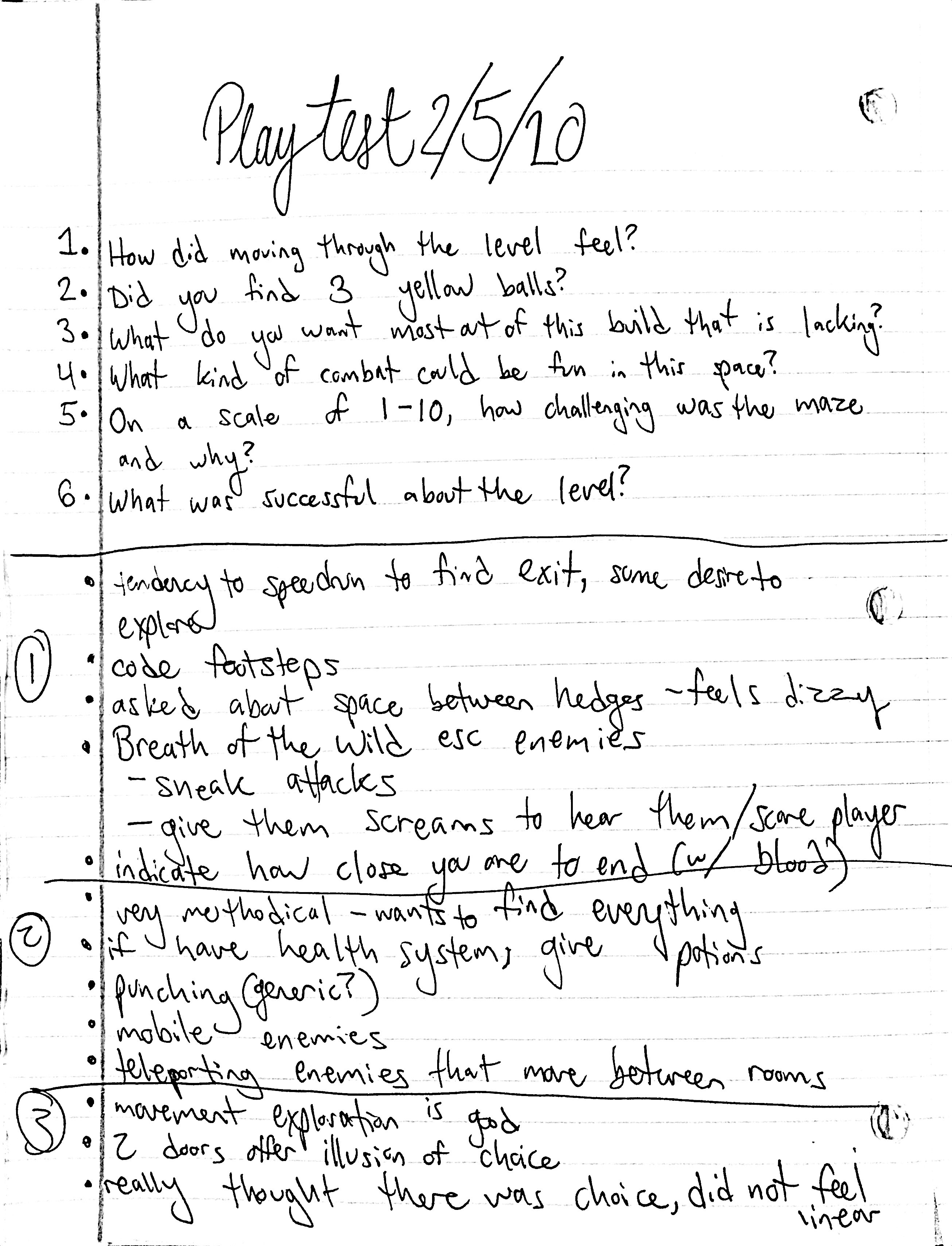
I got 5 of my peers to playtest my Whitebox in class. I have scanned my playtest notes so I could document them here, but the general themes of the feedback and observations were as follows:
- Everyone found the maze challenging, some more than others. Everyone thought that was a good thing.
- Everyone got stuck in the 4th and 5th area, beyond the double doors.
- Some players struggled to find the 3 treasures. Almost everyone missed the first treasure in the top left of the map.
- Many players liked that you could partially see through the walls of the maze.
- The overall layout and design of the maze was effective. Challenging, fun, engaging.
- Players in general tried to avoid enemies.
- There weren't major notes on how to improve the map, but lots of interesting suggestions for the kinds of enemies they wanted to see.
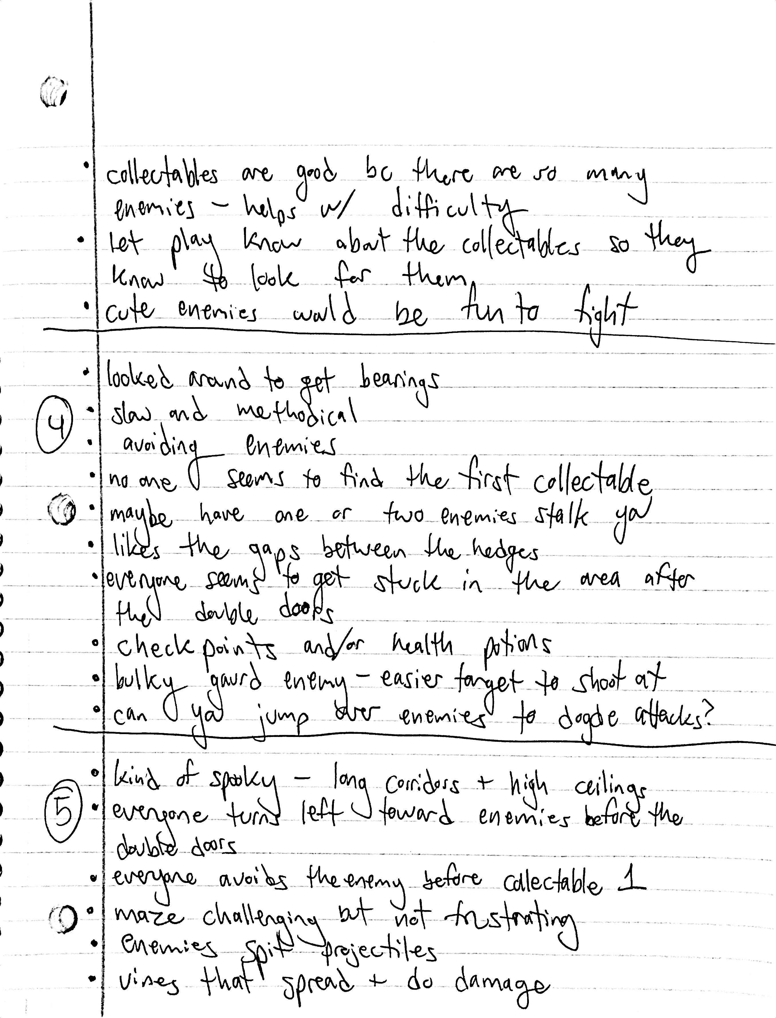
Critical analysis of feedback
What changes will you make to address feedback?
The biggest issue I saw was that players weren't finding the first collectable. They didn't know to look for them, and the first collectable was around the corner from an easily avoidable enemy, so most players never saw it. I decided to create a new first collectable (so now there are 3 instead of 4) and place it directly in the path of the player near the start. That way, the player knows to look for other in-game objects.
I noticed everyone kept getting lost in the area directly behind the two doors. There is no reason to have two doors into this area instead of one, so I replaced one with more walls and added an extra enemy in the newly created alley. Hopefully that will cut down on confusion, but not too much that the maze becomes easy.
What feedback will you not address, and why?
The bulk of the feedback I got was about the kinds of enemies I should implement because I asked about this specifically. I didn't tell players the premise of the level before they played through it, so they suggested a lot of themed enemies that don't fit in a Mellow Meadow. Goblins, enemies that yell, enemies that run after you, cutesy enemies, etc. were some of the suggestions I got that don't fit well with my theme.
A few people asked about what the combat might look like, and they spoke with me about death/healing. The common suggestion was to implement a health bar and hide extra health potions throughout the maze. I think I would rather have a 3-strikes-you're-out health system. I'm not seeing a clear way to have health potions or other healing objects in the maze. Maybe healed flowers could encourage you and "heal" you that way if you return to areas you've already defeated, but I think that would make it too easy. I might try out the idea of checkpoints though. These are things I'll be thinking about as I playtest with combat.
Get Betrothed
Betrothed
Meet your betrothed for a secret rendezvous in the maze!
| Status | In development |
| Author | Haley Price |
| Genre | Adventure |
| Tags | 3D, maze |
More posts
- HW4: Playtest Feedback Blog and Gameplay VideoFeb 26, 2020
- A2: Character StoryFeb 19, 2020
- A1: Feedback In-Class ActivityFeb 17, 2020
- HW1: Level Layouts and ReferencesJan 28, 2020
Leave a comment
Log in with itch.io to leave a comment.