Update 1
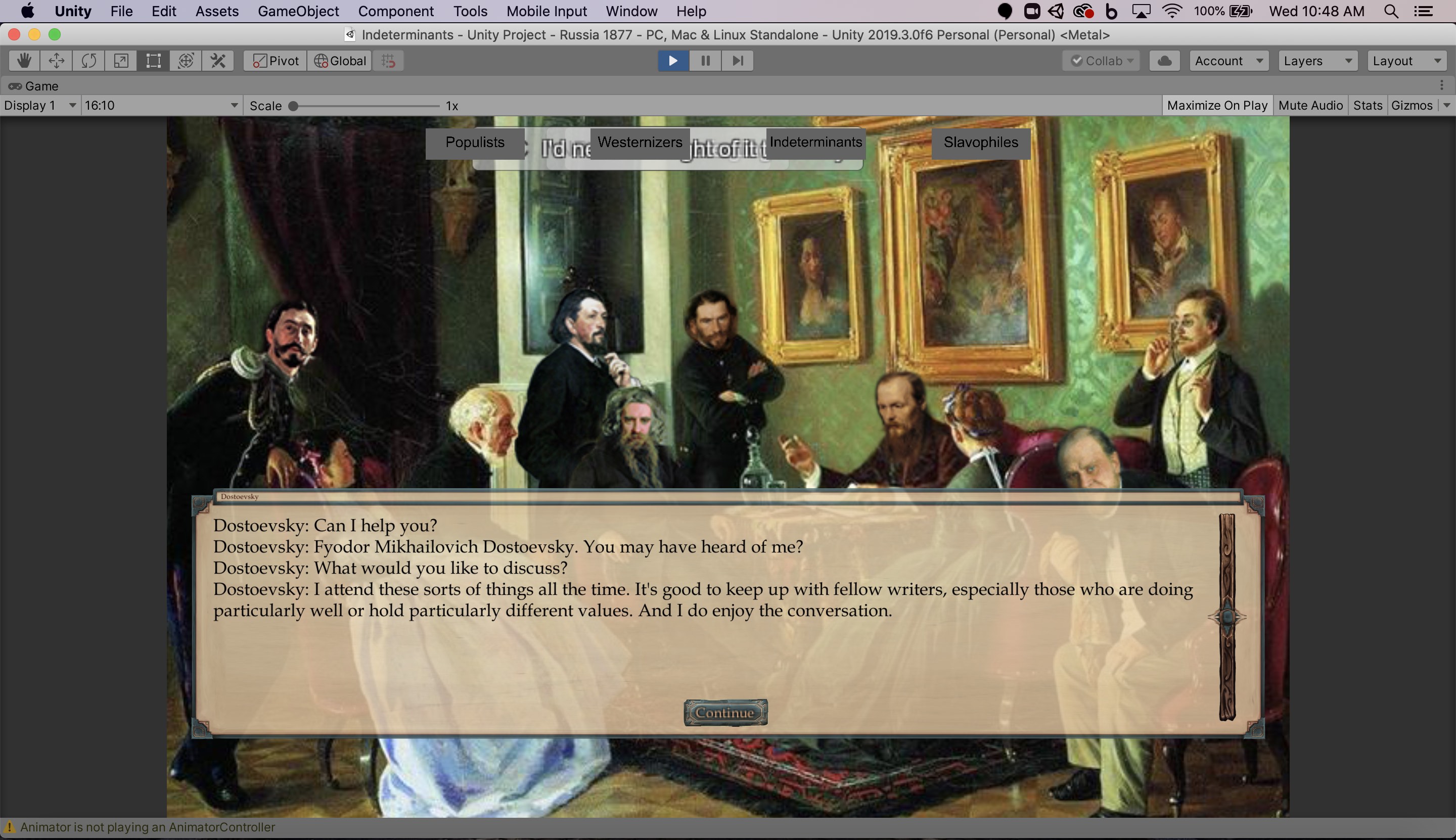
Based on the few playtesting responses I have been able to get so far, I released a small update to make the UI more user friendly to playtesters. Here are the changes I made:
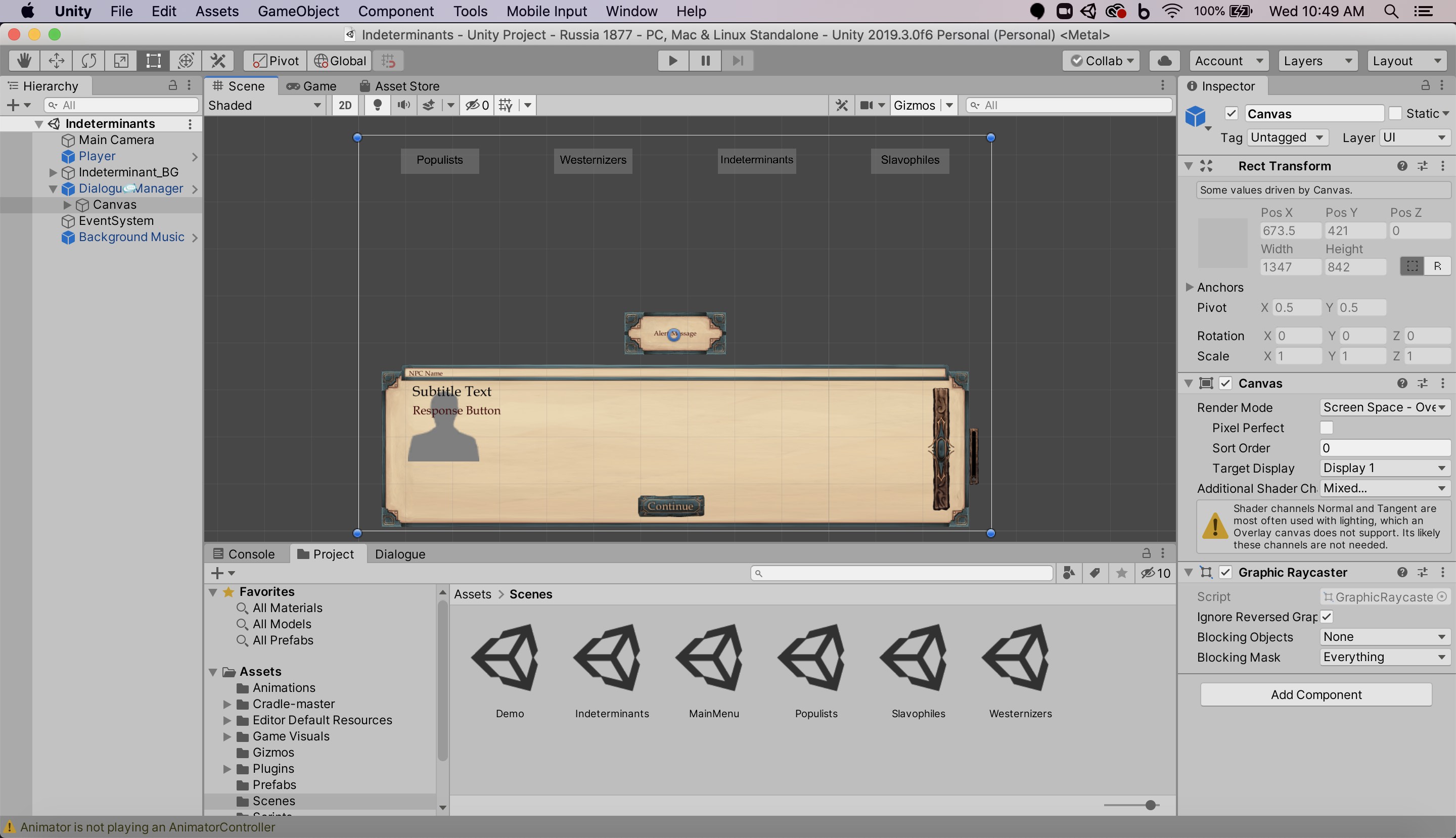
- The menu to navigate between faction scenes is now at the top of each scene.
- The faction buttons are snapped to the top of the scene's canvas, and they display along an x-axis based on political leaning.
- The Populists, being most left-leaning, are on the leftmost side of the screen, followed by the Westernizers, the Indeterminants, and then the conservative Slavophiles.
- I improved the layout of the text box to improve readability.
- I moved the position of the text field.
- I added a continue button that snaps clearly to the bottom center rather than an obscure corner.
- I increased the size of the scroll bar and moved it away from the right edge to make it stand out more.
- I made the Continue button mandatory after every NPC line of dialogue.
- This allows players to click the Continue button to make the dialogue appear more quickly.
- It cues the player in that they have to interact with the dialogue box.
- When there is no Continue button, it clues the player in that a different PC response is required. They have to chose from the response options.
- I made a new build where the game is windowed by default.
- The player has the option to resize the window.
- The UI adjusts cleanly based on the window size.
- This makes it easier to exit the game.
- This helps with resolution (the images are lower quality and can appear pixelated when too big).
- This allows students to have the game open in one window alongside their class readings or zoom lecture for reference.


Files
Russia_Playtest_2_Mac.app.zip 59 MB
Nov 11, 2020
Russia_Playtest_2_PC.zip 60 MB
Nov 11, 2020
Get Reacting to Revolutionary Russia: An Educational Video Game
Reacting to Revolutionary Russia: An Educational Video Game
This game is designed to teach students about Russian literary and revolutionary figures in 1877.
| Status | Released |
| Author | Haley Price |
| Genre | Educational |
| Tags | 2D, Historical, Point & Click, Singleplayer |
| Languages | English |
| Accessibility | One button |
More posts
- PostmortemDec 09, 2020
- Updating the UINov 27, 2020
- Sound Design and AttributionsNov 27, 2020
- Updating the MenuNov 21, 2020
- Updating the BarksNov 21, 2020
- Updating the ArtNov 14, 2020
- FunctionalityNov 03, 2020
- Writing out the DialogueOct 21, 2020
- Making Four ScenesOct 14, 2020

Leave a comment
Log in with itch.io to leave a comment.