Updating the UI
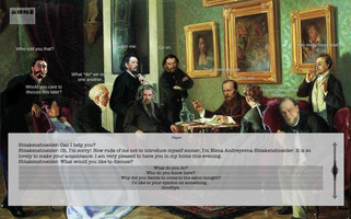
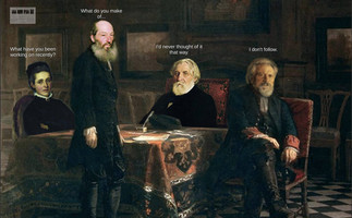
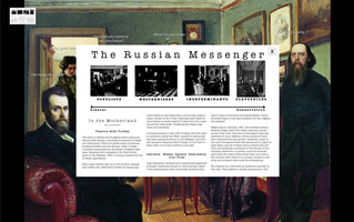
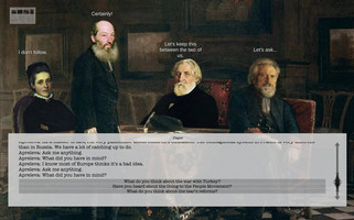
Since most of the gameplay is in the text-box UI, I wanted to make it sleek, simple, and easy-to-read.
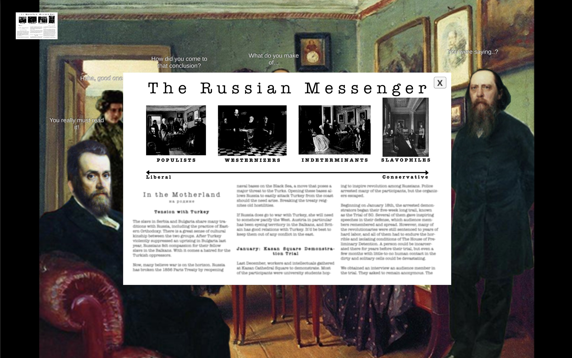
Because the in-class game and my faction selection menu already had newspaper theming, I wanted to continue that look in the dialogue UI. I used the same "American Typewriter" font for most of the text and kept the color palette to neutral newspaper grays. I wanted everything to be slightly transparent so players could still enjoy the game art during a long conversation. The response options and continue button are a slightly darker gray than the background, and they get lighter when the player mouses over and clicks on them. Everything is designed to be simple and intuitive.
The NPC's dialogue collects so that the player can easily review past responses using the scrollbar. The scrollbar is very simple. Its vertical arrow mimics the horizontal one on the faction selection menu.

Get Reacting to Revolutionary Russia: An Educational Video Game
Reacting to Revolutionary Russia: An Educational Video Game
This game is designed to teach students about Russian literary and revolutionary figures in 1877.
| Status | Released |
| Author | Haley Price |
| Genre | Educational |
| Tags | 2D, Historical, Point & Click, Singleplayer |
| Languages | English |
| Accessibility | One button |
More posts
- PostmortemDec 09, 2020
- Sound Design and AttributionsNov 27, 2020
- Updating the MenuNov 21, 2020
- Updating the BarksNov 21, 2020
- Updating the ArtNov 14, 2020
- Update 1Nov 11, 2020
- FunctionalityNov 03, 2020
- Writing out the DialogueOct 21, 2020
- Making Four ScenesOct 14, 2020

Leave a comment
Log in with itch.io to leave a comment.